TL;DR: Explore the new user-friendly features and smart components introduced in the Syncfusion Blazor platform for the 2024 Volume 3 release, complete with vivid, picturesque illustrations.
We are excited to announce that the Syncfusion Essential Studio 2024 Volume 3 release is now available with ground-breaking new controls and features in all supported platforms.
This blog highlights the new user-friendly updates added to the Syncfusion Blazor suite for the 2024 volume 3 release.
New Blazor components
In this 2024 volume 3 release, we are pleased to introduce the four new Blazor components in preview mode:
Smart Paste Button (Preview)
The Blazor Smart Paste Button automatically fills a form with content from the user’s clipboard using text-generative AI functionality. This component enhances the user experience by simplifying data entry and minimizing manual form input.
Key features
Clipboard integration: Pulls data directly from the clipboard, reducing the need for manual typing.
Autofill capability: Automatically populates multiple form fields with a single click, saving time and effort.
Smart data parsing: Intelligently recognizes and formats clipboard data to match the form’s required fields.
Refer to the following image.
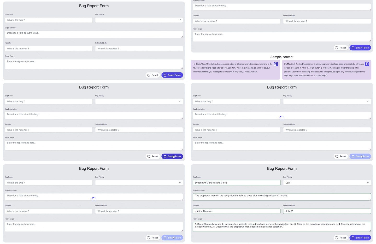
Blazor Smart Paste Button component
Note: For more details, refer to the Blazor Smart Paste Button component demo.
Smart TextArea (Preview)
The Blazor Smart TextArea is an advanced component designed to elevate the text input experience by providing intelligent autocomplete suggestions for entire sentences through text-generative AI functionality. This component enhances user productivity by predicting and offering relevant completions based on the context of what is being typed.
Key features
Intelligent autocomplete: Automatically suggests whole sentence completions based on user input and predefined configurations.
Context-aware predictions: Enhances typing efficiency by predicting the most relevant text completions in real time.
Seamless integration: Easily integrates into existing Blazor apps, providing a smooth and intuitive user experience.
Customizable configuration: Allows tailored suggestions, adapting to specific app needs and user behaviors.
Refer to the following image.

Blazor Smart TextArea component
Note: For more details, refer to the Blazor Smart TextArea component demo.
AI AssistView (Preview)
The Blazor AI AssistView is a versatile, modern UI tool designed to seamlessly integrate AI services into web apps. It enables users to send prompts, execute commands through a feature-rich toolbar, and effortlessly display AI-generated responses in a user-friendly interface.
Key features
Built-in toolbars: Predefined toolbar items such as copy, edit, and like/dislike for easy interaction with prompts and responses.
Prompt suggestions: Supports both initial and on-demand prompt suggestions with a customizable header.
Header toolbar: Allows the addition of toolbar items in the header, providing options for executing custom commands.
Custom views: Extensive customization options for creating personalized views in addition to the built-in assist view.
Appearance customization: Customize the default appearance, including prompts, responses, and more, to suit your specific needs.
Refer to the following image.

Blazor AI AssistView component
Note: For more details, refer to the Blazor AI AssistView demo.
MultiColumn ComboBox (Preview)
TheBlazor MultiColumn ComboBox is a dropdown component that displays items in a detailed, table-like format with multiple columns. It offers more information than standard dropdown lists and enhances user interaction with various advanced features.
Key features
Data binding: Supports binding data from a list of objects and remote data sources using adapters like OData, URLs, and Web APIs.
Grouping: Allows grouping of pop-up list items to enhance the user experience by organizing related items.
Filtering: Provides advanced filtering capabilities to find and select items from large datasets easily.
Sorting: Allows sorting of items in ascending or descending order, with options for single or multicolumn sorting.
Virtualization: Efficiently displays large datasets by loading data on demand.
Templates: Offers templates to customize the control’s appearance and layout, including the header, footer, and pop-up list items.
Refer to the following image.
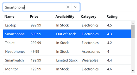
Blazor MultiColumn ComboBox component
Note: For more details, refer to the Blazor MultiColumn ComboBox component demo.
Preview to production-ready components
The Blazor OTP Input and TextArea components have been developed to meet industry standards and are now production-ready for Blazor development.
Common enhancements
Fluent 2 high-contrast theme support: All Syncfusion Blazor components now support the Fluent 2 high-contrast design, enhancing accessibility and visual clarity for users with visual impairments.
Bootstrap 5.3 theme upgrade: The Bootstrap 5 theme used in all Syncfusion Blazor components has been upgraded to Bootstrap 5.3, providing enhanced styling and new features for a more modern and cohesive look.
Lightweight theme: Provided lightweight theme files to optimize performance by excluding larger-size styles. For example, fluent2-lite.css excluded bigger theme styles (‘e-bigger’).
What’s new in our existing Blazor components?
Let’s see the exciting new updates in the existing Blazor components!
Diagram
The new features added to the Blazor Diagram component are as follows:
Flowchart automatic layout
Flowcharts visually represent processes, workflows, systems, or algorithms. This feature automatically arranges flowchart elements clearly, logically, and visually appealingly. It leverages an advanced layout algorithm to position nodes and connectors, whether sourced from the NodeCollection, ConnectorCollection or business objects defined in the DataSource.
Use the automatic flowchart layout algorithm to create flowcharts from external data seamlessly.
Refer to the following image.
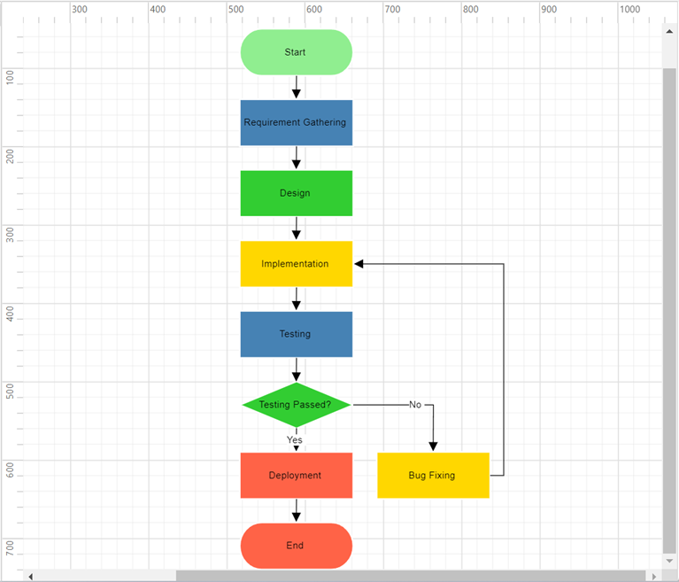
Automatic flowchart layout in Blazor Diagram
Importing and exporting mind map and flowchart mermaid syntax data
Mermaid syntax, a Markdown-inspired language, automatically generates diagrams. This feature allows you to create mind maps and flowcharts directly from Mermaid syntax data, simplifying the visualization of complex ideas and processes without manual drawing. Additionally, you can export your diagrams to Mermaid syntax to easily share and edit across various platforms. AI assistants can also generate Mermaid syntax for your diagrams, which you can directly import into the Diagram control.
Sticky tooltip
Tooltip support has been provided for diagram elements, ensuring that tooltips remain visible while hovering over nodes, connectors, swimlanes, ports, user handles, and fixed user handles. This enhancement allows tooltips to display relevant information consistently.
CRUD actions support
Perform operations like adding, reading, updating, or deleting data in the DataSource at runtime using the ReadAsync, InsertAsync, UpdateAsync, and DeleteAsync methods of the DataSourceSettings class.
Refer to the following image.
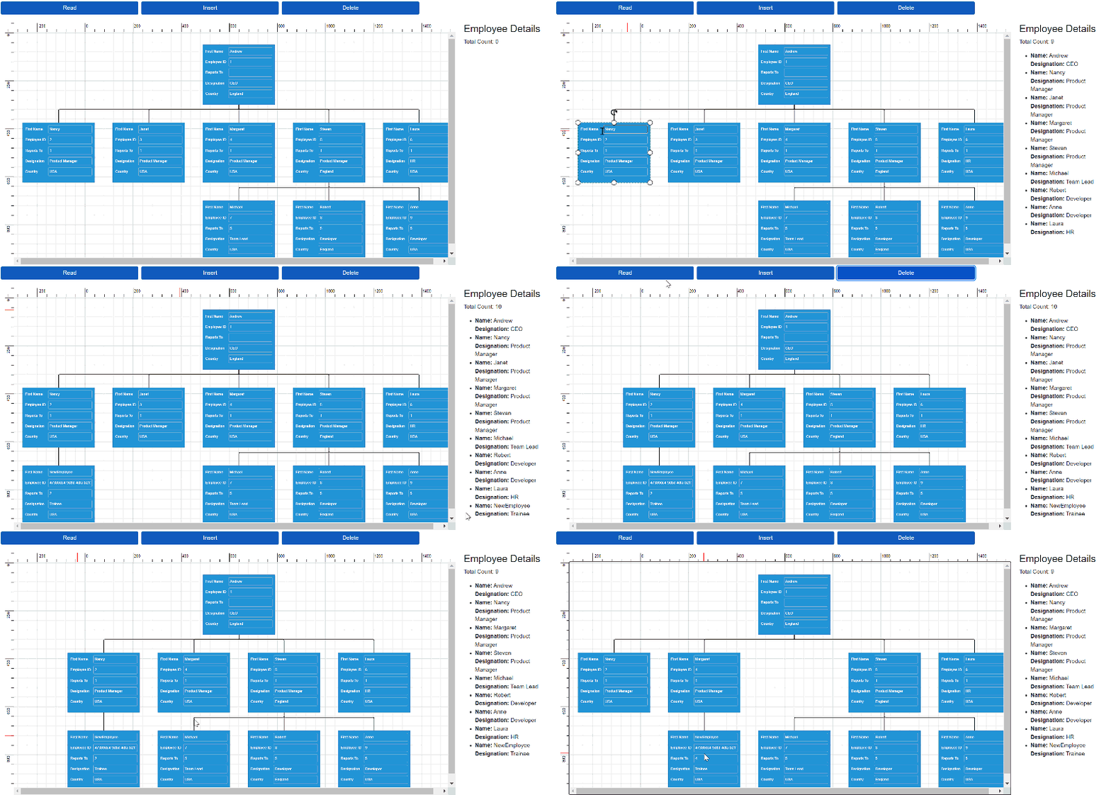
Performing CRUD actions in Blazor Diagram component
Gantt Chart
The new features added to the Blazor Gantt Chart are as follows:
PDF export
Users can export Gantt Chart data to PDF files, enabling the generation of printable reports or sharing data in a standardized format.
Refer to the following image.
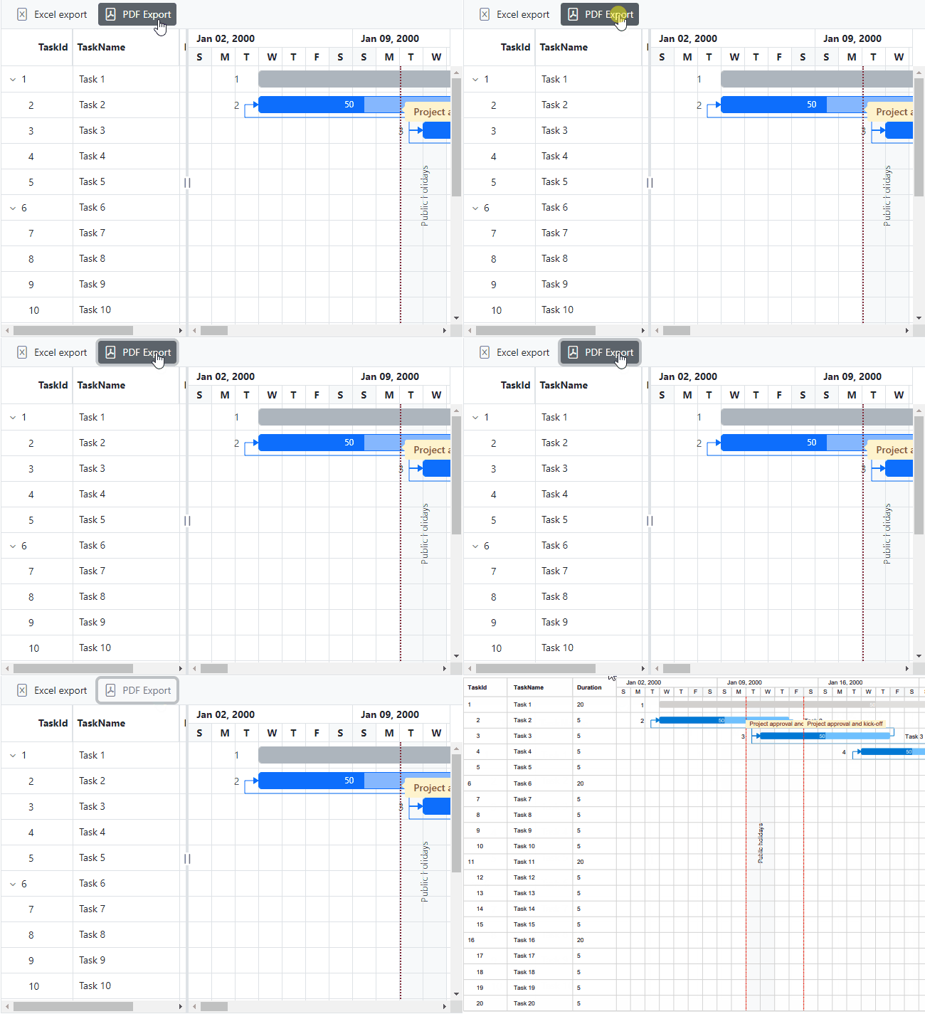
PDF export feature in Blazor Gantt Chart
Touch support for zooming
Users can now easily zoom in and out by pinching directly on the chart pane. This intuitive touch gesture makes navigating through Gantt Charts on touch-enabled devices more convenient, providing a seamless and user-friendly experience.
Image Editor
The Blazor Image Editor is rolled out with the following advanced features:
Redact support
Redact support allows users to conceal sensitive information by applying blur or pixel effects to specific areas of an image. This feature is particularly valuable for protecting privacy and complying with data protection regulations, making it easier to securely share images without compromising sensitive information.
Refer to the following image.
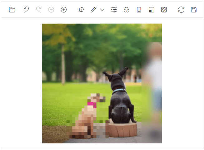
Redact feature in Blazor Image Editor
Text annotation enhancement
The enhanced text-annotation feature in the Blazor Image Editor allows users to customize their annotations with fill color, outline color, and outline width. Ideal for making text stand out and improving readability, this tool ensures that your annotations are clear and visually appealing in any image.
Refer to the following image.
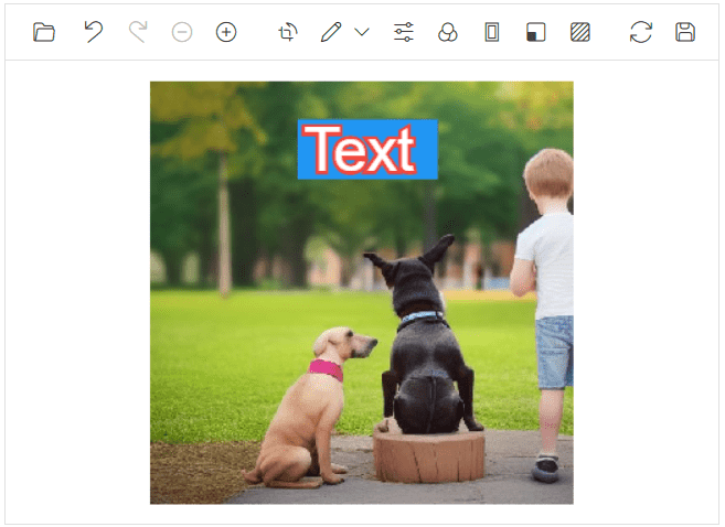
Text annotation enhancements in Blazor Image editor
Rectangle annotation enhancement
The enhanced rectangle-annotation feature in the Image Editor now supports adjusting the border-radius. This allows users to create annotations with rounded or sharp corners. This enhancement provides greater flexibility in customizing the look of your annotations, adding a touch of style and refinement.
Refer to the following image.
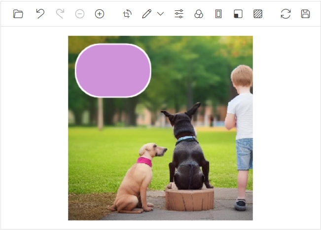
Rectangle annotation enhancement in Blazor Image Editor
Rich Text Editor
The Blazor Rich Text Editor has the following new feature:
Import and export
Easily export content from the Rich Text Editor to PDF or Word documents and seamlessly import Word document content into the editor.
Refer to the following image.
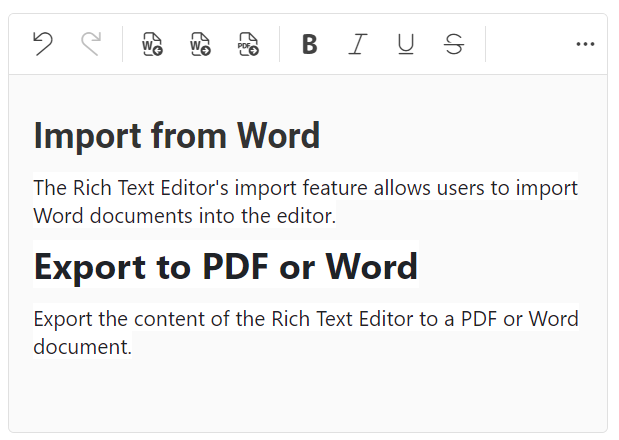
Import and export feature in Blazor Rich Text Editor
File Manager
The Blazor File Manager delivers the following user-friendly features:
Pagination
The Blazor File Manager’s pagination feature enhances app performance by initially loading only the necessary files and folders for the visible layout. Additional items are dynamically loaded as you navigate through the pages.
Refer to the following image.
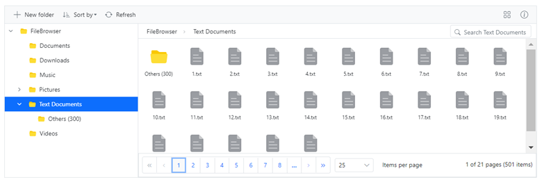
Pagination feature in Blazor File Manager
Range selection
The File Manager now allows users to select a range of files or folders by dragging the mouse pointer over them, similar to the Windows File Explorer.
Refer to the following image.
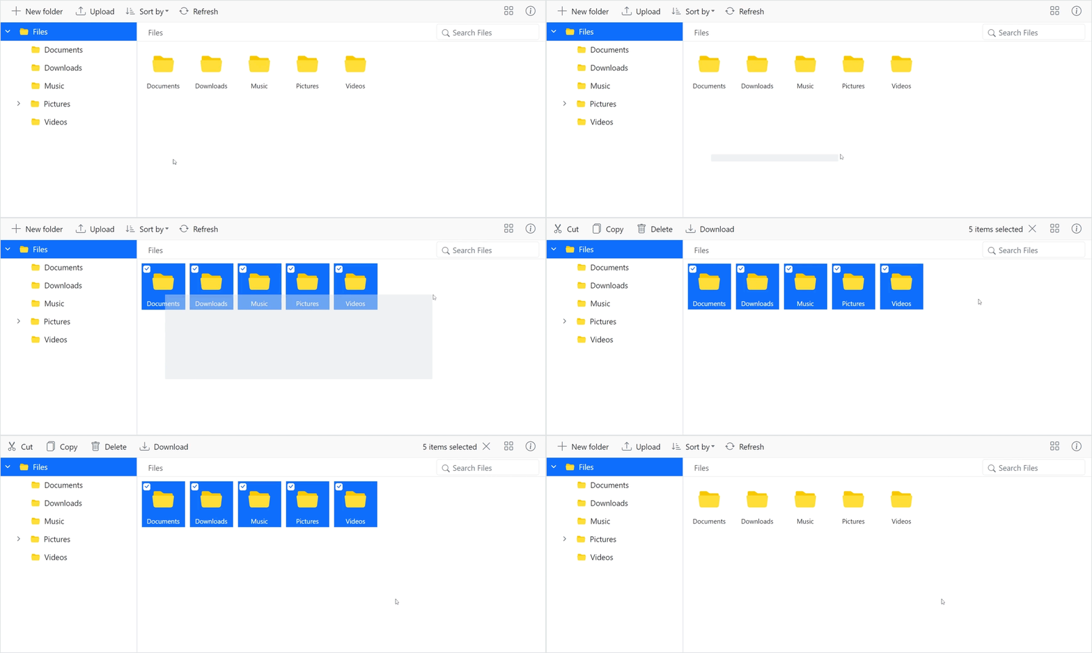
Range Selection feature in Blazor File Manager
SharePoint provider
The SharePoint file service has been implemented to connect as a back-end with Blazor File Manager.
DateTime Picker
Time range selection
The Blazor DateTime Picker now supports restricting time selection to specific daily ranges, such as business hours. Users can only choose times within defined limits, making it ideal for scenarios like appointment scheduling. This feature enhances the user experience by allowing easy configuration of time ranges.
Refer to the following image.
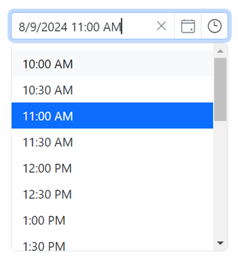
Time range selection feature in Blazor DateTime Picker
Blazor Calendar components
Date parsing
The Blazor Calendar components DatePicker, DateTime Picker, DateRangePicker, and TimePicker) allow users to input date values in various valid formats. This enhancement aims to improve the user experience by offering flexibility in specifying date formats for parsing. Users can specify the expected format(s) for parsing date values such as “dd/MM/yyyy”, “MM/dd/yyyy”, “yyyy-MM-dd”.
Word Processor
Shape support
This feature allows you to preserve shapes in Word documents when opening and saving them in the Blazor Word Processor.
List of preserved shapes:
Lines
Rectangles
Basic shapes
Block arrows
Equation shapes
Flowcharts
Stars and banners
Refer to the following image.
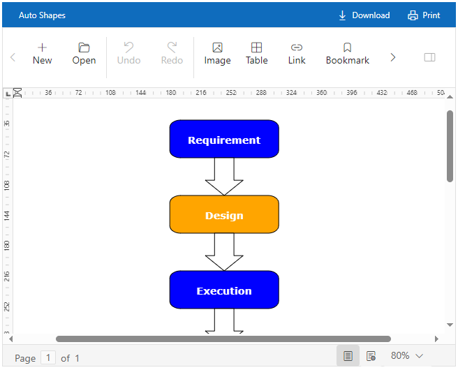
Preserving shapes in Blazor Word Processor
Mention
Disable individual items
The Blazor Mention component provides options for individual items to be enabled or disabled for specific scenarios. This ensures the disabled items cannot be selected as values within the component.
Refer to the following image.
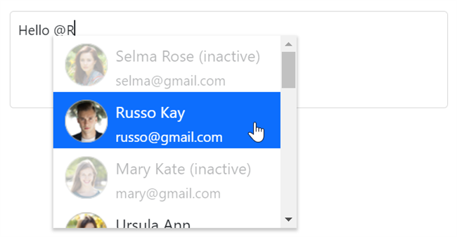
Disabling individual items in Blazor Mention component
Barcode Generator
QR code with logo support
This feature in the Blazor Barcode Generator allows us to embed a logo or image in the center of your QR codes. This will enhance the brand visibility and make your QR codes more visually appealing. You can customize the logo size, which defaults to one-third of the QR code’s dimensions. The size is automatically adjusted to ensure it doesn’t exceed 30% of the code’s width or height, maintaining scan efficiency. The logo can be sourced from a local image path, Base64-encoded image, online image URL, or icon.
Refer to the following image.

QR code with logo support in Blazor Barcode Generator
Conclusion
Thanks for reading this blog! We’ve explored the new components and features added to the Syncfusion Blazor suite for the 2024 Volume 3 release. To discover more about the features available in this release, please visit our Release Notes and What’s New pages. Try them out and leave your feedback in the comments section below!
Existing Syncfusion users can access the most recent version of Essential Studio on the License and Downloads page. If you’re new to Syncfusion, we offer a 30-day free trial to test these exciting new features.
You can also reach us through our support forum, support portal, or feedback portal. We are always happy to assist you!
