TL;DR: Master the art of font usage in Syncfusion Angular Charts to enhance data visualization and readability. This blog post covers best practices for customizing titles, subtitles, axis labels, legends, and data labels using tailored font styles and sizes.
Textual elements are crucial for improving the readability and understanding of data in charts. Each type of text serves a distinct purpose, enhancing the overall clarity and effectiveness of the chart. By using customizable APIs, you can tailor these elements to meet specific user needs.
Syncfusion Angular Charts is a well-crafted charting component for data visualization. It contains a rich UI gallery of 50+ charts and graphs, ranging from line to financial, that cater to all charting scenarios. Its high performance helps render large amounts of data quickly.
In this blog post, we’ll see how to master font usage in the Syncfusion Angular Charts for better visualization and readability.
The role of fonts
Fonts do more than convey text; they play a key role in making your data clear and comprehensible. Choosing the right fonts and utilizing them effectively can significantly impact how your charts are interpreted.
Good font use helps highlight important information, enhances readability, and gives your chart a professional appearance. This guide offers straightforward strategies for selecting and applying fonts in your charts, ensuring they are both attractive and easy to read.
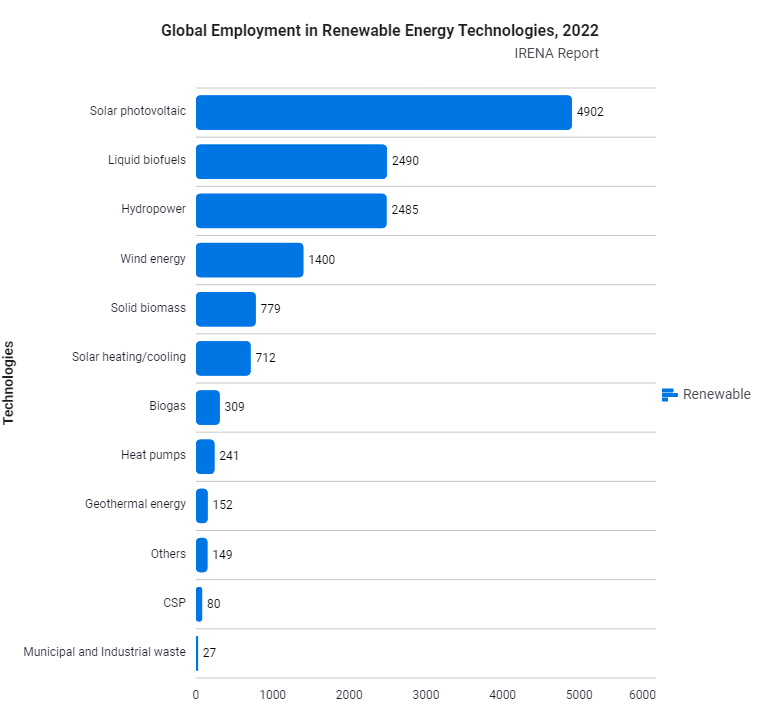
Example: Consider a chart that illustrates global employment in renewable energy technologies for 2022. The text is styled with default size, font styles and family.

To enhance elegance and readability in charts, select fonts that are both clean and visually balanced. Use a bold, larger font for titles to emphasize key information, and opt for smaller, lighter fonts for labels and axis descriptions to maintain clarity without distraction.
Title and subtitles
A chart title should clearly convey its content, providing viewers with immediate insights into the presented data. It should be in bold font to enhance clarity and visibility.
The subtitle adds context to the title, including details such as the period covered, the data source, and a brief explanation of the chart’s purpose. It should be displayed in a slightly less bold font than the title to maintain readability while differentiating its role.
For example, the title could be formatted with a font size of 16px, weight 600, using the Segoe UI font family, while the subtitle could use 14px, weight 400, also in Segoe UI. This typographic approach enhances the chart’s readability and helps convey the visualized data effectively.
app.component.ts
// Title style.
 public titleStyle: Object = {
    fontFamily: 'Segoe UI',
    fontWeight: '600',
    size: '16px'
  };
// Subtitle style.
 public subTitleStyle: Object = {
    fontFamily: 'Segoe UI',
    fontWeight: '400',
    size: '14px'
  };
Axis labels and axis title
Axis labels are essential text elements positioned along a chart’s horizontal or vertical axis, clearly indicating what each axis measures. They provide vital context by indicating whether the axis represents categories, periods, or numerical values, which helps viewers interpret and understand the presented data accurately.
An axis title is a descriptive text placed along a chart’s horizontal or vertical axis that clearly explains what the axis represents. It helps viewers understand the measured data type by specifying whether the axis shows categories, time intervals, or numerical values.
In this example, the Y-axis title represents “Technologies,”. The axis titles should be more prominent than the axis labels to ensure that they stand out. Therefore, the axis titles have a font size of 13px, a font weight of 500, and use the Segoe UI font family. In contrast, the axis labels, which indicate intervals or specific values, are slightly lighter, with a font size of 12px and a font-weight of 400, and use the Segoe UI font family. This distinction helps enhance the visibility and clarity of the chart’s key information.
app.component.ts
public primaryXAxis: Object = {
    titleStyle: {
        fontFamily: 'Segoe UI',
        fontWeight: '500',
        size: '13px'
    },
    labelStyle: {
        fontFamily: 'Segoe UI',
        fontWeight: '400',
        size: '12px'
    }
};
Legend and legend text
A legend is an essential part of a chart that explains what each color, pattern, or symbol represents. It helps viewers quickly identify and understand the different data series or categories shown in the chart.
In this example, the legend text details the specific categories of technologies. The legend text is also set to a font size of 14px but with a font-weight of 400, using the same Segoe UI font family.
app.component.ts
public legend: Object = {
   visible: true,
   position: 'Right',
   textStyle: { fontFamily: 'Segoe UI', size: '14px', fontWeight: '400' }
 };
Data labels
Data labels are textual elements placed directly on or near data points in a chart. They display specific values or information related to each data point, making it easier for viewers to interpret the exact figures or details in the chart.
Data labels are designed to provide information about specific points in a series. The data label text should be slightly smaller to ensure clarity and prevent overlapping with other chart elements.
In this example, the data labels use a font size of 12px, a font-weight of 400, and the Segoe UI font family for better readability and minimal interference with the chart.
app.component.ts
export class AppComponent {
 public marker = {
      dataLabel: {visible: true, position: 'Outer', font: { size: '12px', weight: '400', fontFamily: 'Segoe UI' }}
  }
}
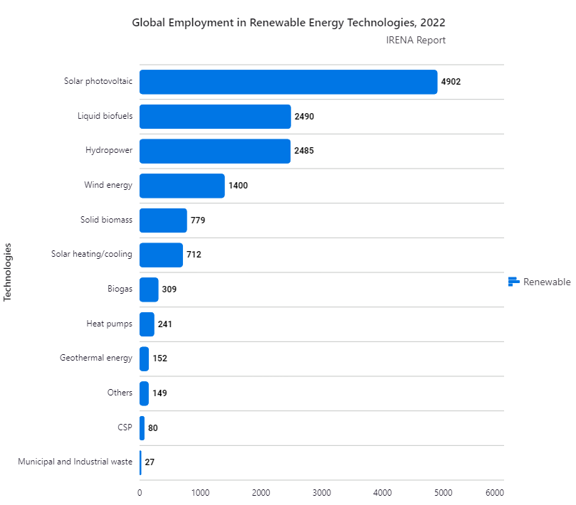
Please refer to the following image to visually observe the font customizations explained above, where bold fonts are used for titles and lighter fonts for labels and legends.

Angular Chart with Customized Fonts
Reference
For more details, refer to the demos for font usage in the Angular Charts on Stackblitz.
Conclusion
Thanks for reading! This blog post shows how to effectively use fonts in the Syncfusion Angular Charts for better data visualization. We encourage you to try out this font hierarchy and leave feedback in the comments below.
For questions, you can contact us through our support forums, support portal, or feedback portal. We are always happy to assist you!
