TL;DR: Let’s see how the Syncfusion® .NET MAUI Bottom Sheet elevates app functionality with dynamic height, interactive gestures, and customizable content. Ideal for menus, quick actions, and overlays, this sliding panel integrates seamlessly with themes and supports popup mode for focus. Explore its adaptability for hosting lists, forms, or grids with enhanced theming options.
We’re excited to introduce the new Bottom Sheet control in the Syncfusion® .NET MAUI toolkit. You can explore this control on NuGet or in our GitHub repository.
The Bottom Sheet is a sliding panel anchored at the bottom of the screen, commonly used in mobile and desktop applications. It allows users to access secondary information or perform actions while maintaining the context of the underlying content. Typical use cases include displaying menus, additional settings, or detailed views of list items.
Key features of the .NET MAUI Bottom Sheet control
Dynamic height customization
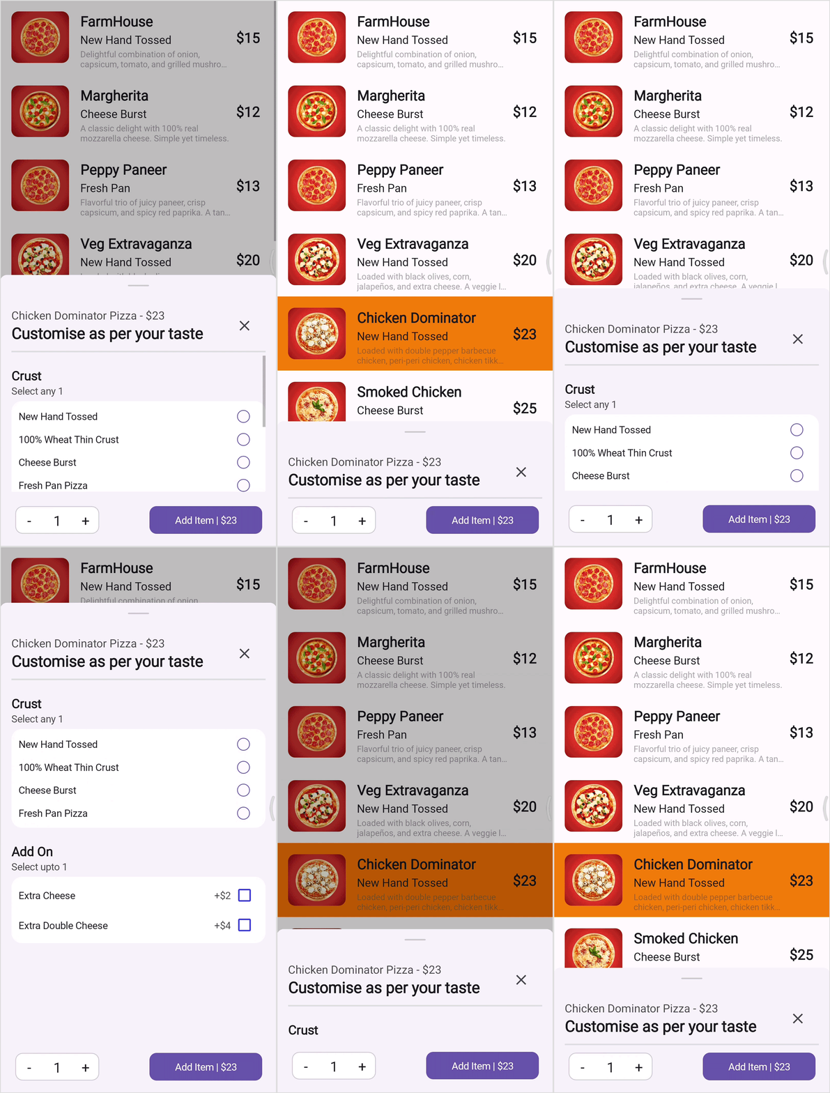
The .NET MAUI Bottom Sheet allows seamless height adjustment to fit various screen states, such as Hidden, Collapsed, Half Expanded, and Full Expanded. This feature enables developers to dynamically configure these states using properties like FullExpandedRatio, HalfExpandedRatio, and CollapsedHeight. This ensures optimal use of screen space for different content scenarios.
Refer to the following image.

Dynamic height customization in .NET MAUI Bottom Sheet
Expanding and collapsing
When the user experience demands explicit control over the Bottom Sheet’s state, .NET MAUI provides programmatic options to manage it effectively. Using the IsOpen property or the Show and Close methods, you can dynamically control whether the Bottom Sheet should be displayed.
Interactive gestures
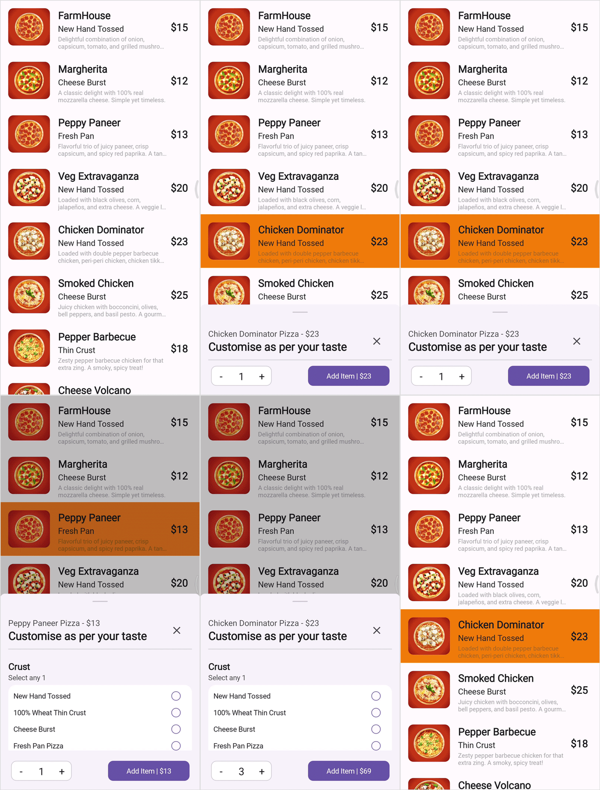
Interactive gestures enable users to intuitively drag the Bottom Sheet upwards or downwards, transitioning between collapsed, half-expanded, and fully expanded states.
Refer to the following image.

Interactive gestures in .NET MAUI Bottom Sheet control
Customizable content
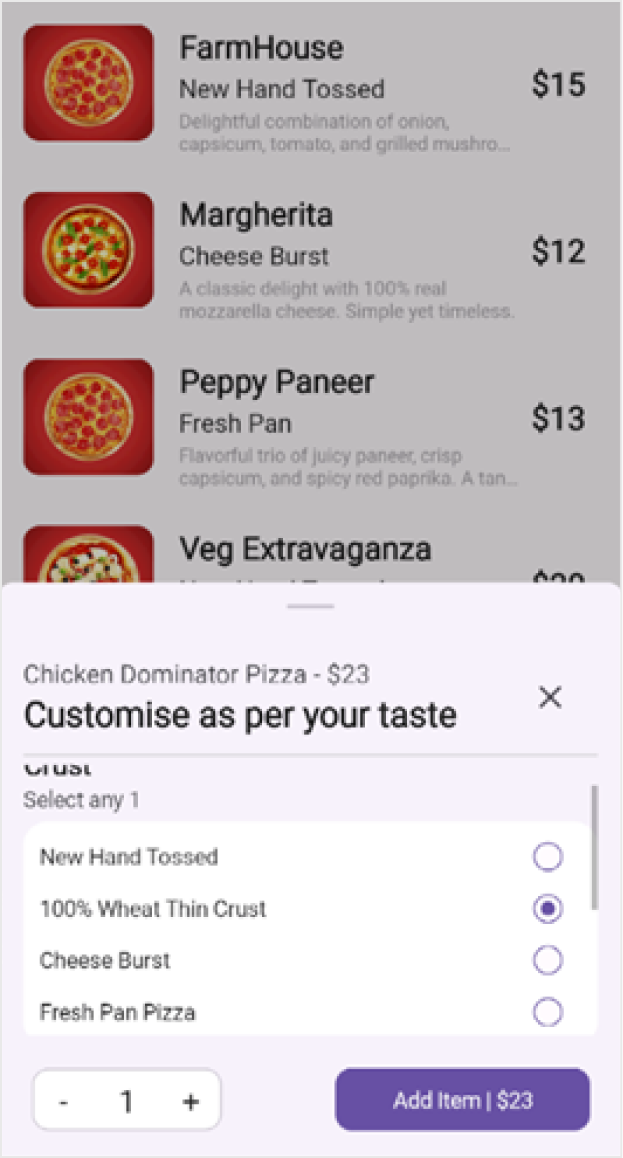
The .NET MAUI Bottom Sheet serves as an adaptable container capable of hosting various types of content. This makes it ideal for numerous use cases. Whether you wish to incorporate lists, grids, forms, images, or custom layouts, the Bottom Sheet offers the flexibility to tailor its content to fit your app’s requirements.

Customizable content in .NET MAUI Bottom Sheet
Popup mode
In certain scenarios, it is crucial to ensure that users are focused solely on the Bottom Sheet’s content by disabling interactions with the background. This is especially useful for modal-like Bottom Sheets where critical information or actions require undivided attention.
Theming and styling
The Bottom Sheet seamlessly integrates with your app’s theme, ensuring a consistent look and feel throughout the user interface. It adapts dynamically to light and dark modes, maintaining readability, usability, and aesthetic harmony.

Use cases and apps
Consider using the .NET MAUI Bottom Sheet control for a variety of scenarios:
Profile overlays: Allow users to view or edit profiles without leaving the main screen.
Quick actions: Display action menus to streamline user navigation.
Expandable playlists or notifications: Present music playlists, notifications, or task details without intrusive screen transitions.
Note: For more details, refer to the .NET MAUI Bottom Sheet documentation.
Getting started with the .NET MAUI Bottom Sheet control
Let’s see how to integrate the .NET MAUI Bottom Sheet control into your app.
Step 1: Create a .NET MAUI project
Begin by creating a .NET MAUI project.
Step 2: Add the Syncfusion® .NET MAUI MAUI toolkit package
Syncfusion® .NET MAUI toolkit controls are available on the NuGet Gallery. In Visual Studio, open the NuGet package manager, search for Syncfusion.Maui.Toolkit, and install it.
Step 3: Register the handler
In the MauiProgram.cs file, register the handler for Syncfusion® .NET MAUI Toolkit. Refer to the following code example.
using Syncfusion.Maui.Toolkit.Hosting;

public static class MauiProgram
{
    public static MauiApp CreateMauiApp()
    {
        var builder = MauiApp.CreateBuilder();
        builder
            .ConfigureSyncfusionToolkit()
            .UseMauiApp<App>()
            .ConfigureFonts(fonts =>
            {
                fonts.AddFont("OpenSans-Regular.ttf", "OpenSansRegular");
                fonts.AddFont("OpenSans-Semibold.ttf", "OpenSansSemibold");
            });

        return builder.Build();
    }
}
Step 4: Add the namespace
Include the Syncfusion.Maui.Toolkit.BottomSheet namespace in your XAML page.
XAML
xmlns:bottomSheet="clr-namespace:Syncfusion.Maui.Toolkit.BottomSheet;assembly=Syncfusion.Maui.Toolkit"
Step 5: Initialize the Syncfusion® .NET MAUI Bottom Sheet control
Now, initialize the Syncfusion® .NET MAUI Bottom Sheet control.
<bottomSheet:SfBottomSheet x:Name="bottomSheet" />
Step 6: Set content to the .NET MAUI Bottom Sheet control
Refer to the following code example to configure the main content for the Bottom Sheet control.
<bottomSheet:SfBottomSheet x:Name="bottomSheet" CollapsedHeight="180">
  <bottomSheet:SfBottomSheet.Content>
    <Grid>
      <ListView x:Name="ListView" ItemsSource="{Binding Items}" RowHeight="105"
                      ItemTapped="OnListViewItemTapped">
          <ListView.ItemTemplate>
            <DataTemplate>
              <ViewCell>
                <Grid ColumnDefinitions="auto, *, 50” ColumnSpacing="0" Padding="16">
                  <Border StrokeThickness="0">
                    <Border.StrokeShape>
                      <RoundRectangle CornerRadius="10" />
                    </Border.StrokeShape>
                    <Image Source="{Binding ImageName}" />
                  </Border>
                  <VerticalStackLayout Grid.Column="1" Spacing="2" Padding="16,0,0,0">
                    <Label Text="{Binding FoodName}" FontSize="20" FontAttributes="Bold" FontFamily="Roboto"/>
                    <Label Text="{Binding SubName}" FontSize="16" FontFamily="Roboto" />
                    <Label Text="{Binding Description}" FontSize="12" LineBreakMode="TailTruncation" MaxLines="2" FontFamily="Roboto"/>
                  </VerticalStackLayout>
                  <Label Text="{Binding Price, StringFormat='${0}'}" FontAttributes="Bold" FontSize="20" FontFamily="Roboto" VerticalOptions="Center" HorizontalOptions="Center" Grid.Column="2" />
                </Grid>
             </ViewCell>
           </DataTemplate>
         </ListView.ItemTemplate>
       </ListView>
    </Grid>
  </bottomSheet:SfBottomSheet.Content>

</bottomSheet:SfBottomSheet>
Refer to the following code example to customize the Bottom Sheet control.
<bottomSheet:SfBottomSheet x:Name="bottomSheet" CollapsedHeight="180">
    <bottomSheet:SfBottomSheet.Content>
      <!--Add your content-->
    </bottomSheet:SfBottomSheet.Content>

    <bottomSheet:SfBottomSheet.BottomSheetContent>
      <Grid RowDefinitions="auto, *, 80" x:Name="Grid">
        <Grid RowDefinitions="*, auto">
          <VerticalStackLayout>
            <Label>
              <Label.FormattedText>
                <FormattedString>
                    <Span Text="{Binding FoodName, StringFormat='{0} Pizza'}" FontAttributes="None"/>
                    <Span Text=" - " FontAttributes="None" />
                    <Span Text="{Binding Price, StringFormat='${0}'}" />
                </FormattedString>
              </Label.FormattedText>
            </Label>
            <Label Text="Customise as per your taste" FontSize="22" FontAttributes="Bold" FontFamily="Roboto"/>
          </VerticalStackLayout>
          <Border HeightRequest="2" Grid.Row="1" Margin="0, 10,0,5"/>
       </Grid>
     </Grid>
  </bottomSheet:SfBottomSheet.BottomSheetContent>
</bottomSheet:SfBottomSheet>
Refer to the following image.

Integrating Bottom Sheet control in .NET MAUI app
GitHub reference
For more details, refer to the .NET MAUI Bottom Sheet control demo on GitHub.
Conclusion
Thanks for reading! In this blog, we’ve explored the features of the new Syncfusion® .NET MAUI Bottom Sheet control. This powerful tool is for developers looking to enhance the intuitiveness and functionality of their apps.
For additional controls and advanced features, consider exploring the complete suite of Essential Studio® for .NET MAUI controls. This suite includes robust line-of-business controls like DataGrid, ListView, and Scheduler, all designed to ensure seamless integration and enhance your development experience.
If you have any questions or require assistance, you can contact us through our support forums, support portal, or feedback portal. We are always happy to assist you!
Related Blogs
Create Stunning AI-Powered .NET MAUI Charts Using Natural Language
Transform JSON into Stunning Charts: Auto-Generate Visuals with Syncfusion® .NET MAUI Toolkit
Visualizing Skyscraper Data with .NET MAUI Doughnut Chart and Maps
Syncfusion Essential® UI Kit for .NET MAUI: Accelerate App Development with Pre-Built UI Pages
