TL;DR: Explore the new Flutter Chat widget from the 2024 Volume 3 release! It supports customizable one-on-one and group chats with features like message bubbles, headers, footers, and placeholders. Learn how to integrate it into your Flutter app with step-by-step instructions and customize it to your needs.
We’re glad to introduce the new Flutter Chat widget in the Essential Studio 2024 Volume 3 release!
The Flutter Chat is designed to enhance communication with a modern, customizable conversational UI. It supports one-on-one and group chats and offers a range of features that allow you to tailor every aspect of the chat experience.
Let’s explore the vivid features of the Flutter Chat widget and the steps to getting started with it.
Key features
The key features of the Flutter Chat widget are as follows:
Messages
Placeholder
Composer
Action button
Message bubble
Header
Footer
Avatar
Content
Messages
The Flutter Chat widget displays a list of ChatMessage objects as incoming or outgoing messages, depending on the user ID. Each message includes message text, a timestamp, and author details. You can extend this class to include additional information about the chat message.
Placeholder
When no messages are in the chat, a custom widget will be displayed. This feature is especially useful, as it can include relevant messages for the user, indicating that the conversation is empty. With this custom widget, users will have a clearer understanding of the chat’s status, enhancing their overall experience.
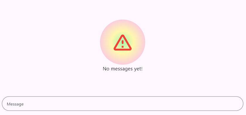
Placeholder in Flutter Chat widget
Composer
The default text editor is a basic utility that enables users to create and compose new messages easily. This editor is designed to be fully flexible, down to its visual presentation. Users can customize many aspects of the text editor, from adding hint text to guide them on what to type to incorporating borders that enhance its appearance. Additionally, the text editor allows users to add prefix and suffix icons, which can help convey the meaning or function associated with the messages they compose.
Beyond these customization options, the text editor features an important capability: it allows users to replace any widget as the primary composer. This is particularly useful when users want to incorporate advanced functionality, such as adding leading and trailing icons that can serve as indicators or quick buttons for further actions. Furthermore, this flexibility enables the integration of multi-level widgets, significantly enhancing the user experience by providing a richer and more versatile messaging interface.
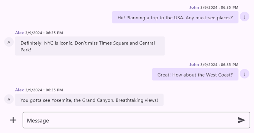
Composer in Flutter Chat widget
Action button
The action button is also known as a send button. The callback is triggered when the user clicks this action button, enabling the outgoing user to update the chat widget with the newly composed message.
Besides the normal send button, one can also have a custom widget that embeds one or more interactive widgets. These become action buttons inside the chat widget. These widgets can include various functions, like a microphone icon for voice input, attaching files to share documents or images, and other interactive widgets that enrich user interaction.
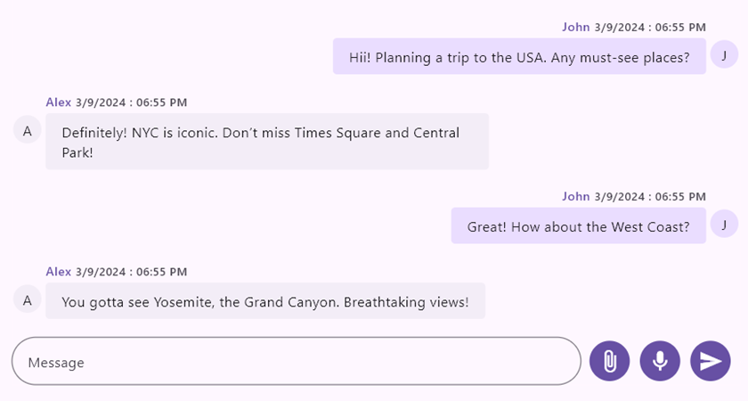
Action button in Flutter Chat widget
Message bubble
Displays the message content, whether incoming or outgoing, tailored to the current user’s perspective. Each message displayed contains a few key pieces of information, including the message text, a timestamp indicating when it was sent or received, and information about the message’s author.
Header
It displays the username of a user who sent a message and the time it was sent. The user can also create a custom widget with more information about messages in the chat.
Footer
By default, the chat widget does not have a footer; however, users can design a custom widget that displays additional information in chat messages, such as the sending time, delivery status, etc.
Avatar
The author’s avatar will either appear as an image or their initials. The user’s initials will be shown by default if the avatar image source is not defined. The user can also create a custom widget with more information about the author.
Content
Displays the message content, allowing users to customize the background color, content shape, and others based on the respective message user or specific conditions. The user can also create a custom widget that provides more information about messages in the chat, such as the importance of the message, the reading count, and so on.
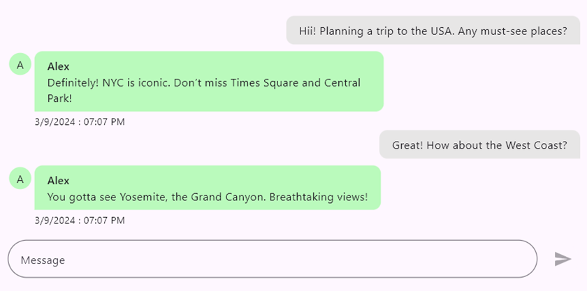
Flutter Chat widget displaying the message content
Getting started with the Flutter Chat widget
We’ve explored the Flutter Chat widget’s user-friendly features. Now, let’s see how to integrate it into your Flutter app.
Step 1: Add the dependency
First, add the Syncfusion Flutter Chat dependency to your pubspec.yaml file.
dependencies:
  syncfusion_flutter_chat: *.*.* // Use the latest available version in pub.dev.
Step 2: Get the packages
Then, run the following command to get the required packages.
flutter pub get
Step 3: Import the Chat library
Now, import the Chat library using the following code.
import 'package:syncfusion_flutter_chat/chat.dart';
Step 4: Add the Flutter Chat widget
Add the Flutter Chat widget with the required properties, such as messages and outgoingUser.
List<ChatMessage> _messages = []; // Load if there are existing messages.
@override
Widget build(BuildContext context) {
  return SfChat(
    outgoingUser: _currentUser.id,
    messages: _messages,
    composer: const ChatComposer(
      decoration: InputDecoration(
        hintText: 'Message',
      ),
    ),
    actionButton: ChatActionButton(
      onPressed: (String newMessage) {
        // Handle the send button click action.
      },
    ),
  );
}
Step 5: Handle the send button action
By default, the chat widget does not rebuild itself when clicking the send button. Therefore, it is necessary to create a new message object using the newly composed message passed in the parameter of the onPressed callback in the ChatActionButton, and then rebuild the widget using the setState function.
actionButton: ChatActionButton(
  onPressed: (String newMessage) {
    setState(() {
      _messages.add(ChatMessage(
        text: newMessage,
        time: DateTime.now(),
        author: _currentUser,
      ));
    });
  },
),
Refer to the following output GIF image.
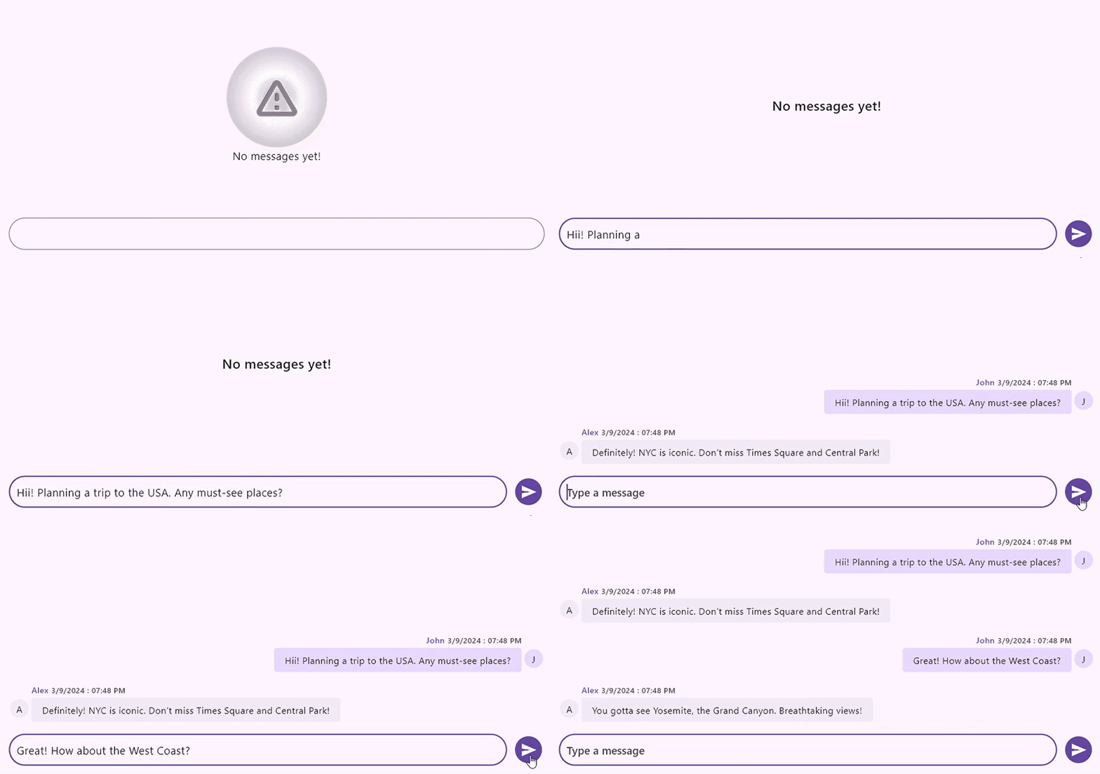
Integrating the Chat widget in the Flutter app
GitHub reference
For more details, refer to the Flutter Chat widget demo on GitHub.
Conclusion
Thanks for reading! In this blog, we’ve explored the new Flutter Chat widget, which was rolled out in the 2024 Volume 3 release. For more information, please check the Flutter Chat documentation.
For current Syncfusion customers, the newest version of Essential Studio is available from the license and downloads page. If you are not a customer, try our 30-day free trial to check out these new features.
If you need a new widget for the Flutter framework or new features in our existing widgets, you can contact us through our support forum, support portal, or feedback portal. As always, we are happy to assist you!
