Create a Flutter 3D Column Chart to Showcase the Top 6 Renewable Energy-Consuming Countries
TL;DR: Explore how to create a visually striking Flutter 3D Column Chart to showcase renewable energy consumption by the top 6 countries. Learn to build, customize, and enhance interactivity with custom data labels, 3D effects, and a tailored series renderer for unique visuals.
Welcome to Our Chart of the Week Blog Series!
In this blog, we’ll walk you through how to build a visually engaging Flutter 3D Column Chart using the Syncfusion Flutter Charts library. We’ll showcase the top 6 renewable energy-consuming countries, with custom data labels and tooltips for enhanced interactivity.
Column Chart
A Column Chart is an effective method of representing categorical data using vertical bars. It is ideal for comparing data across different groups, in this case, the renewable energy consumption by various countries.
3D Column series renderer
The onCreateRenderer callback allows you to assign a custom 3D series renderer to render unique shapes for each segment by creating a custom renderer class, such as _CustomColumn3DSeriesRenderer, which extends the ColumnSeriesRenderer class.
In this custom renderer, the key methods include:
createSegment for defining segments based on data,
customizeSegment for adjusting the appearance of each segment, and
onPaint for managing the drawing of the series.
The custom series allows you to create unique visual effects for your chart by extending the default chart series behavior.
In this tutorial, we’ll focus on creating a 3D effect for both the column track and energy-consuming columns. By using a custom series renderer, you can define a custom painter to render 3D elements that add depth and interactivity to your chart.
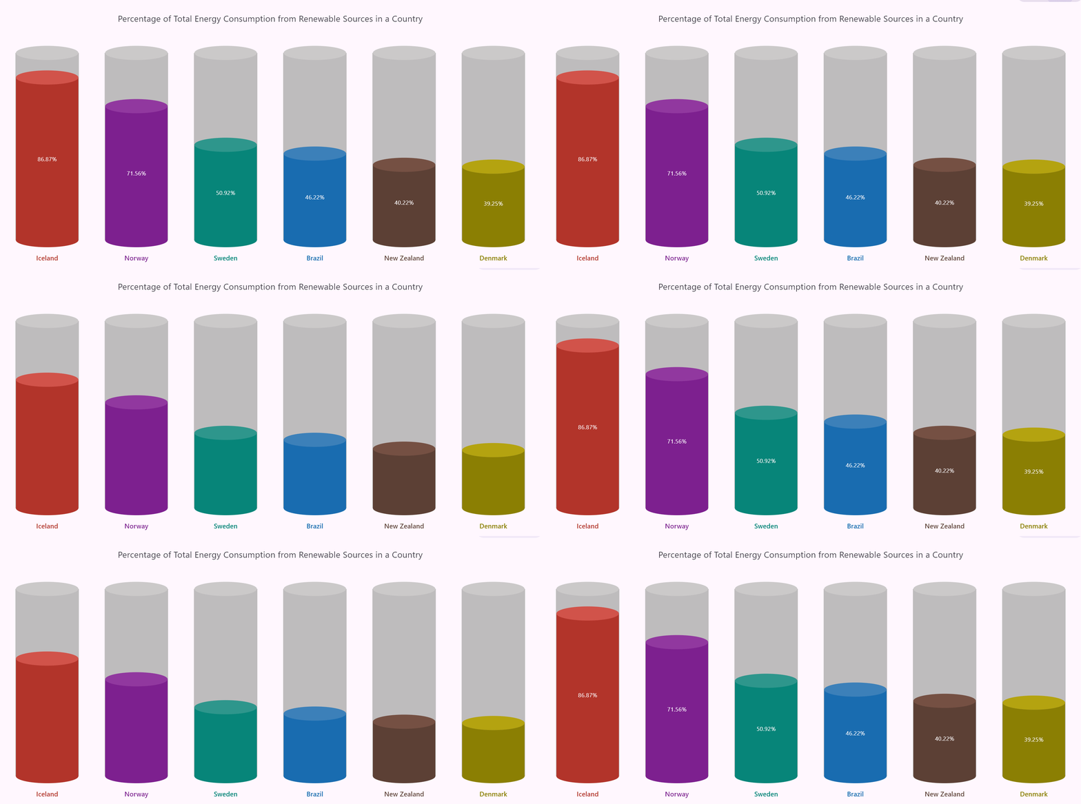
Let’s visualize the data of the top 6 renewable energy-consuming countries using the Syncfusion Flutter Column Chart!
Refer to the following image.
Let’s get started!
Step 1: Gather the data
First, let’s collect data on the top 6 renewable energy-consuming countries.
Step 2: Initialize the data for the chart
Now, create an energy data model that represents the country’s name and energy consumed in percentages.
class EnergyData {
  EnergyData(this.country, this.energyConsumedPercent);
  final String country;
  final double energyConsumedPercent;
}
Next, a list will be initialized to hold the country’s energy consumption data, adding color data for the oval shape at the top and energy consumed data for each country.
late List<EnergyData> _energyConsumedData;
late Map<String, Color> _cylinderColors;
late Map<String, Color> _ topOvalColors;

void initState() {
  _energyConsumedData = <EnergyData>[
    EnergyData('Iceland', 86.87),
    EnergyData('Norway', 71.56),
    EnergyData('Sweden', 50.92),
    EnergyData('Brazil', 46.22),
    EnergyData('New Zealand', 40.22),
    EnergyData('Denmark', 39.25),
  ];
  _cylinderColors = {
    'Iceland': const Color.fromARGB(255, 178, 52, 43),
    'Norway': const Color.fromARGB(255, 125, 31, 142),
    'Sweden': const Color.fromARGB(255, 8, 133, 120),
    'Brazil': const Color.fromARGB(255, 25, 108, 176),
    'New Zealand': const Color.fromARGB(255, 92, 63, 53),
    'Denmark': const Color.fromARGB(255, 139, 126, 4)
  };
  _topOvalColors = {
    'Iceland': const Color.fromARGB(255, 210, 83, 74),
    'Norway': const Color.fromARGB(255, 145, 56, 160),
    'Sweden': const Color.fromARGB(255, 47, 150, 140),
    'Brazil': const Color.fromARGB(255, 59, 128, 185),
    'New Zealand': const Color.fromARGB(255, 117, 80, 67),
    'Denmark': const Color.fromARGB(255, 179, 163, 15)
  };
  super.initState();
}
Step 3: Building a Flutter Column Chart
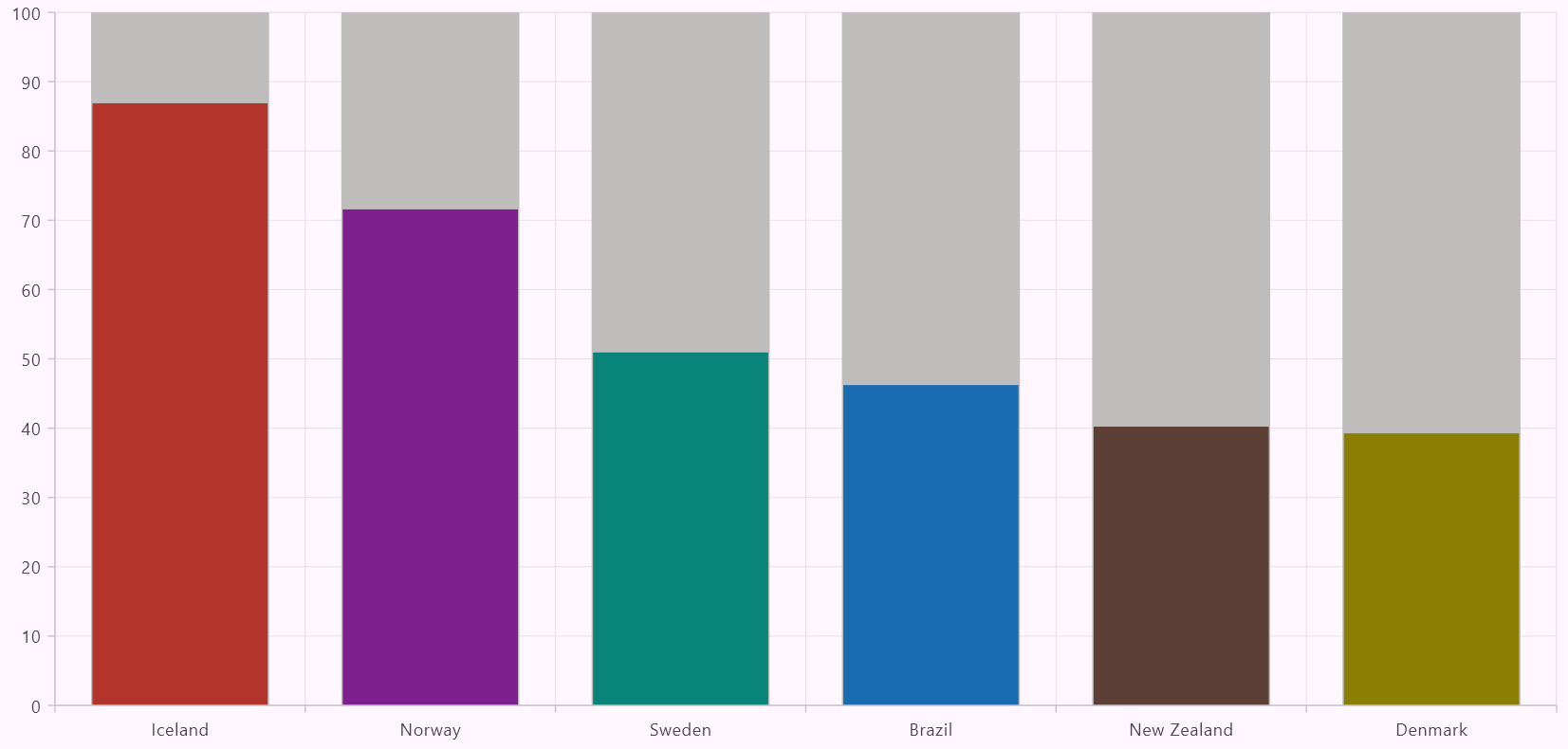
To render a Flutter Column Chart with a track, a single ColumnSeries is used to visualize energy consumption data alongside a visible background track. The X-axis is set to CategoryAxis, representing categorical data like country names, while the Y-axis is set to NumericAxis for numeric values to display the energy consumption in percentage.
The ColumnSeries is configured to display a track by setting the isTrackVisible property to true. The track serves as the background layer, providing visual separation and context for the actual data columns.
Create the energy-consumed data series
This series overlays the energy-consumption data onto the track. The yValueMapper is used to map the percentage of energy consumed to the Y-axis, while the pointColorMapper dynamically assigns colors to the columns based on the country name. This ensures each data point is visually distinct and easy to interpret.
Refer to the following code example.
@override
Widget build(BuildContext context) {
  return Scaffold(
    body: SfCartesianChart(
      primaryXAxis: const CategoryAxis(),
      series: <CartesianSeries<EnergyData, String>>[
        ColumnSeries<EnergyData, String>(
          dataSource: _energyConsumedData,
          xValueMapper: (EnergyData data, index) => data.country,
          yValueMapper: (EnergyData data, index) =>
              data.energyConsumedPercent,
          pointColorMapper: (EnergyData data, index) =>
              _cylinderColors[data.country],
          isTrackVisible: true,
          trackColor: const Color.fromARGB(255, 191, 188, 188),
        ),
      ],
    ),
  );
}
Refer to the following image.
Creating a Flutter Column Chart
Step 4: Customize the axes appearance
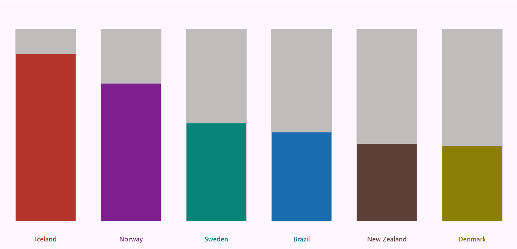
For the primaryXAxis, we’ll use a CategoryAxis to represent countries. We’ll customize the appearance by removing the majorGridLines, majorTickLines, and axisLine. We’ll also customize the labelPosition to display it inside the chart.
For the primaryYAxis, we will use a NumericAxis to represent the energy consumed values in a percentage format. We’ll set the isVisible property to false to hide the Y-axis labels. Additionally, we’ll adjust the plotOffsetStart and plotOffsetEnd values to 50 to add padding at the start and end of the plot area, enhancing the chart’s visual appeal.
Additionally, you can customize the axis labels using the axisLabelFormatter callback to utilize the ChartAxisLabel class to adjust the textStyle of the axis labels according to your needs. Then, set the plotAreaBorderWidth to 0 to remove the border around the series.
Refer to the following code example.
plotAreaBorderWidth: 0,
primaryXAxis: CategoryAxis(
  majorGridLines: const MajorGridLines(width: 0),
  majorTickLines: const MajorTickLines(width: 0),
  axisLine: const AxisLine(width: 0),
  axisLabelFormatter: (axisLabelRenderArgs) {
    TextStyle textStyle = Theme.of(context)
        .textTheme
        .titleSmall!
        .copyWith(color: _cylinderColors[axisLabelRenderArgs.text]);
    return ChartAxisLabel(axisLabelRenderArgs.text, textStyle);
  },
  labelPosition: ChartDataLabelPosition.inside,
),
primaryYAxis: const NumericAxis(
  isVisible: false,
  plotOffsetStart: 50,
  plotOffsetEnd: 50,
),
Refer to the following image.
Customizing the axes appearance in Flutter Column Chart
Step 5: Adding chart title
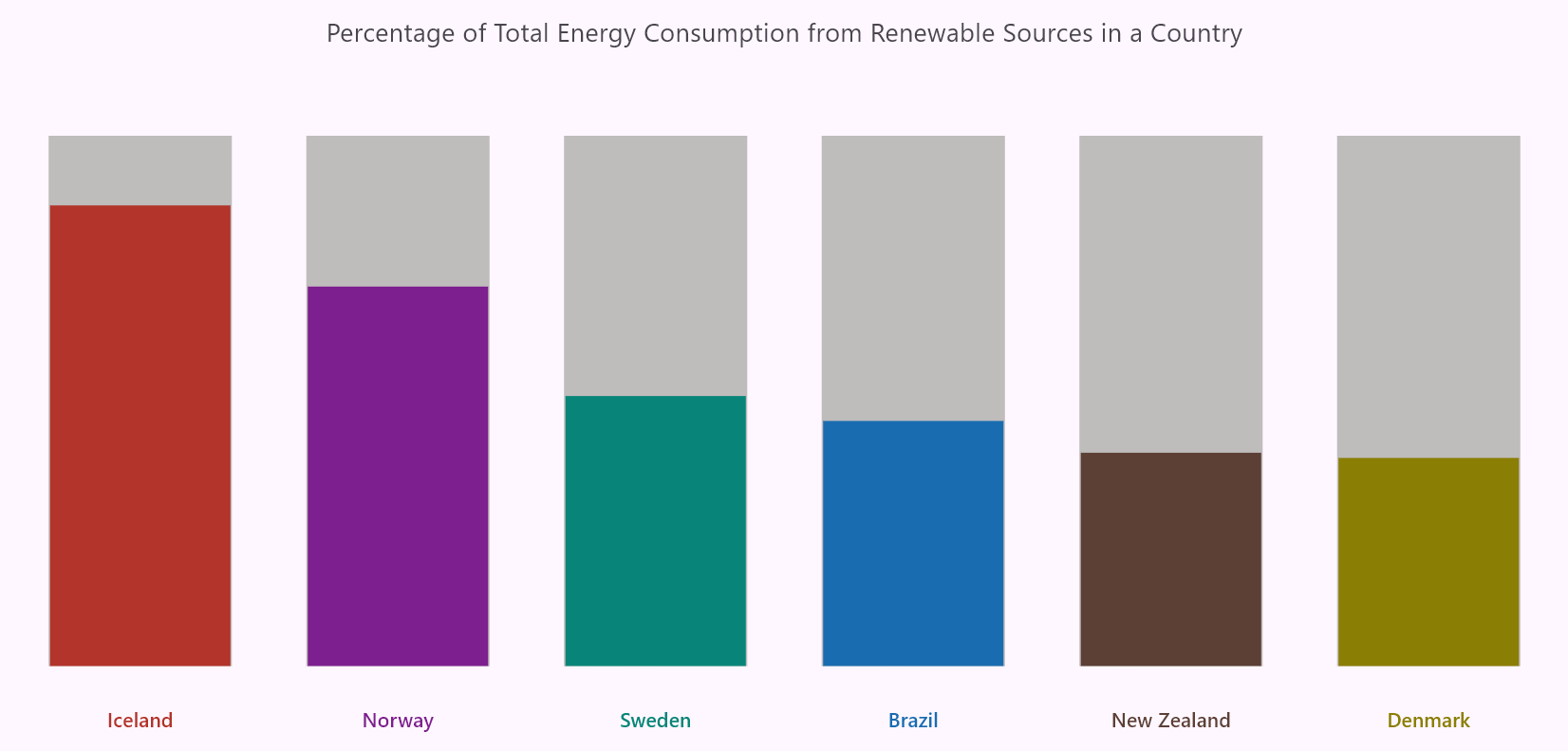
Let’s use the ChartTitle widget to add and customize the chart title. The title is aligned to the center using the alignment property, and we’ve set the ChartAlignment value as the center. The text property is used to set the chart’s title.
ChartTitle(
    alignment: ChartAlignment.center,
    text: 'Percentage of Total Energy Consumption from Renewable Sources in a Country'),
Refer to the following image.
Adding title to the Flutter Column Chart
Step 6: Creating a custom 3D series renderer
The onCreateRenderer callback enables the creation of a custom 3D series renderer, allowing you to render unique shapes for each segment. To achieve this, we need to define a custom renderer class, such as _CustomColumnSeriesRenderer, that extends the ColumnSeriesRenderer class.
In this custom renderer, the key methods include,
createSegment: Creates segments for the series based on data points.
onPaint: Paints the series according to customizations, including the previously customized segments.
ColumnSeries(
  ...
  onCreateRenderer: (ChartSeries<EnergyData, String> series) {
    return _CustomColumn3DSeriesRenderer();
  },
),
Custom 3D series renderer for Column Chart
The CustomColumn3DSeriesRenderer class extends the ColumnSeriesRenderer to create a custom 3D visualization for column series based on the EnergyData model. This renderer uses a topOvalColors map to specify the colors for the top ovals of the 3D columns based on the country names. The createSegment method is overridden to return a custom column segment, CustomColumn3DSegment, which handles drawing 3D effects for each column.
The _CustomColumn3DSegment class extends ColumnSegment and implements the onPaint method to add a custom 3D segment. Within the onPaint method:
The countryName is determined based on the current segment index, mapping the X-values to their raw data.
The trackerTop, bottomOval, and topOval rectangles are calculated using the ovalRect helper method, which creates an oval based on the Y-coordinate and radius.
The painting logic includes:
trackerTopOval – Drawing a light gray oval at the top of the tracker for the 3D shadow effect.
bottomOval – Painting the bottom oval using the fill color at the bottom of each segment.
animatedTopOval – Painting the top oval using the color defined in the topOvalColors corresponding to the country name. The animation is applied to the top oval by calculating its position dynamically based on the animationFactor. The segmentRect’s height is interpolated to animate the oval’s position smoothly as the column grows.
The ovalRect helper method generates a rectangular bounding box for the ovals. It takes the center Y-coordinate and calculates the dimensions using a fixed radius of 15. The resulting 3D series effect gives the columns a visually distinct appearance and makes the data representation more engaging and intuitive.
Refer to the following code example.
class _CustomColumn3DSeriesRenderer
  extends ColumnSeriesRenderer<EnergyData, String> {
   _CustomColumn3DSeriesRenderer(this.topOvalColors);

   final Map<String, Color> topOvalColors;

   @override
   ColumnSegment<EnergyData, String> createSegment() {
     return _CustomColumn3DSegment(topOvalColors);
   }
}

class _CustomColumn3DSegment extends ColumnSegment<EnergyData, String> {
  _CustomColumn3DSegment(this.topOvalColors);

  final Map<String, Color> topOvalColors;

  @override
  void onPaint(Canvas canvas) {
    final String countryName = series.xRawValues[currentSegmentIndex]!;
    final double trackerTop = series.pointToPixelY(0, 100);
    final Rect trackerTopOval = ovalRect(trackerTop);
    final Rect bottomOval = ovalRect(segmentRect!.bottom);
    final Rect animatedTopOval = ovalRect(segmentRect!.bottom -
        ((segmentRect!.bottom - segmentRect!.top) * animationFactor));

    super.onPaint(canvas);
    canvas.drawOval(trackerTopOval,
        Paint()..color = const Color.fromARGB(255, 204, 201, 201));
    canvas.drawOval(bottomOval, Paint()..color = fillPaint.color);
    canvas.drawOval(
        animatedTopOval, Paint()..color = topOvalColors[countryName]!);
  }

  Rect ovalRect(double ovalCenterY) {
    const double ovalRadius = 15;
    return Rect.fromLTRB(segmentRect!.left, ovalCenterY - ovalRadius,
        segmentRect!.right, ovalCenterY + ovalRadius);
  }
}
Refer to the following image.
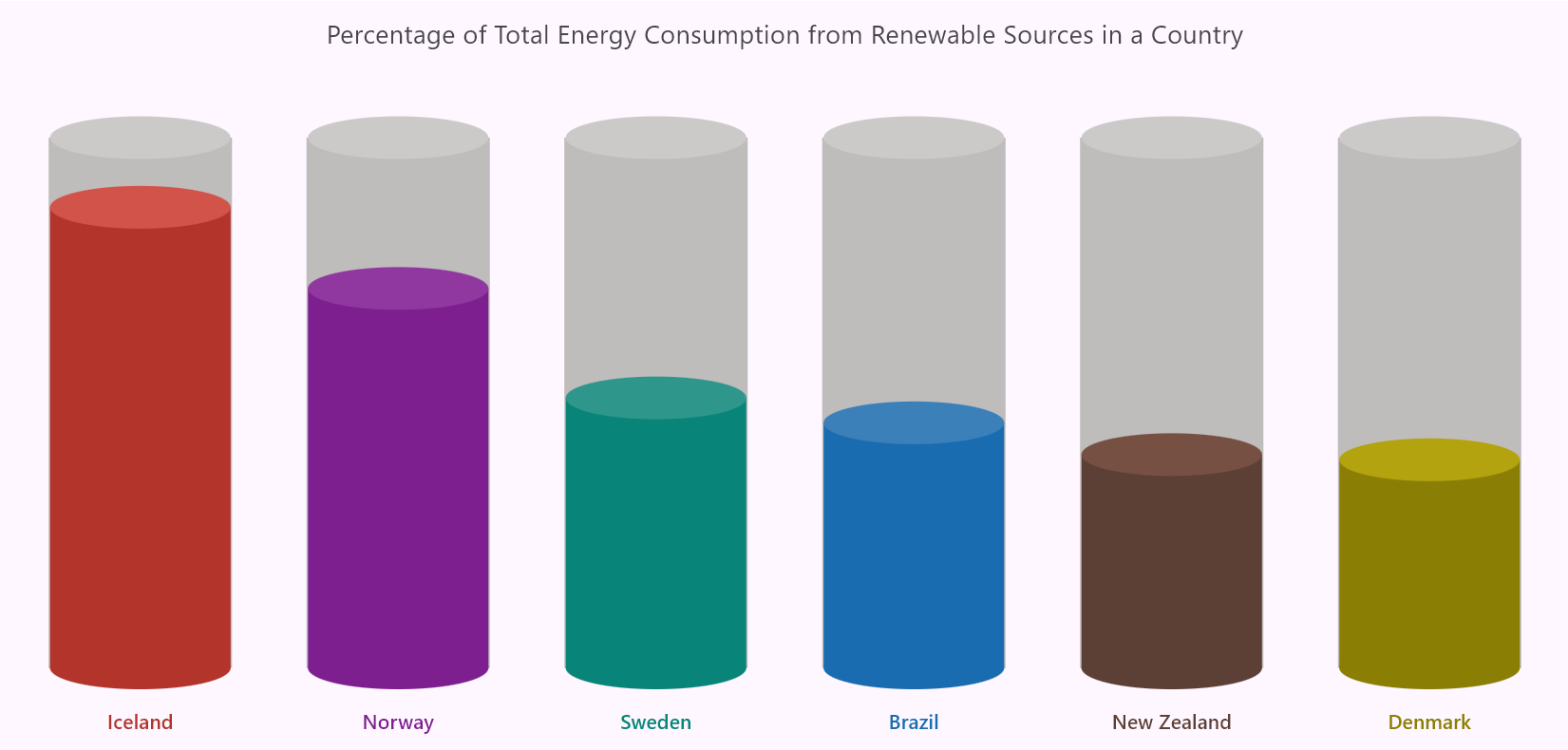
Creating a custom 3D series renderer for the Flutter Column Chart
Step 7: Customizing the data label
The onDataLabelRender callback is used to adjust the appearance of data labels. The text property is updated to include a percentage symbol alongside the displayed value.
onDataLabelRender: (DataLabelRenderArgs dataLabelArgs) {
  dataLabelArgs.text = '${dataLabelArgs.text}%';
},
Step 8: Adding and customizing tooltip
Let’s enable the TooltipBehavior to display the additional data when hovering over data points. The onTooltipRender callback customizes the tooltip text by splitting it into a formatted header and value. The text is split by ‘ : ‘, assigning the first part as the header [Country name] and the second part as the text [energy consumed percent] on the tooltip.
tooltipBehavior: TooltipBehavior(enable: true),
onTooltipRender: (TooltipArgs tooltipArgs) {
  List<String> tooltipText = tooltipArgs.text!.split(' : ');
  tooltipArgs.header = tooltipText[0];
  tooltipArgs.text = '${tooltipText[1]}%';
},
Refer to the following image.
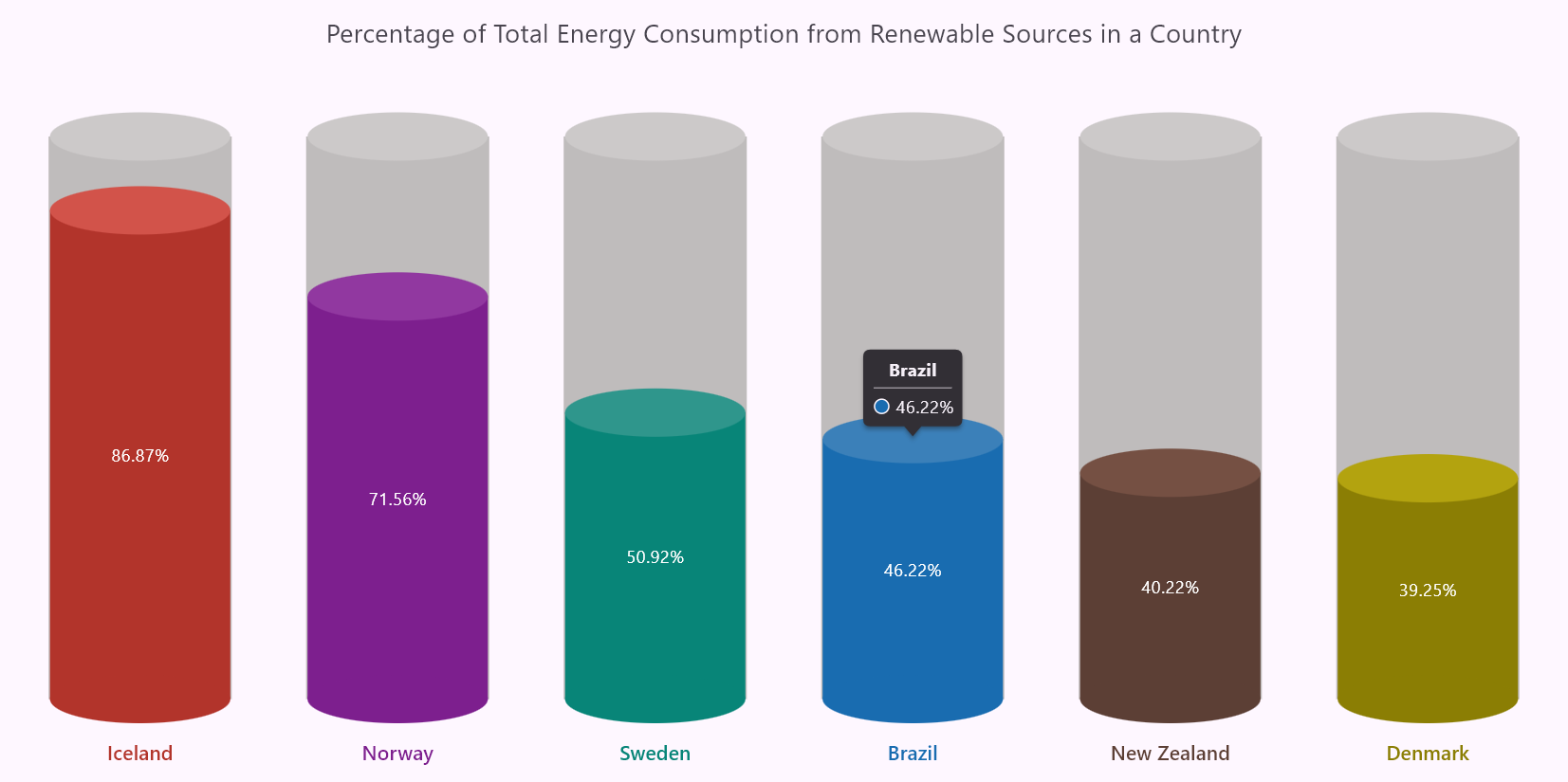
Adding tooltips to the Flutter Column Chart
Step 9: Customizing data label settings and animation controller in the series
Let’s show the energy consumed data on each ColumnSeries and position them in the middle of each segment by setting the labelAlignment property as middle. Additionally, the animationDuration property is set to 2000 milliseconds, which animates the column series smoothly over 2 seconds when the chart is rendered.
Refer to the following code example.
series: <CartesianSeries<EnergyData, String>>[
 ColumnSeries<EnergyData, String>(
    ...
    dataLabelSettings: const DataLabelSettings(
      isVisible: true,
      labelAlignment: ChartDataLabelAlignment.middle),
    animationDuration: 2000,
  ),
],
Refer to the following image.

Visualizing the top 6 renewable energy-consuming countries using the Flutter 3D Column Chart
GitHub reference
For more details, refer to the Flutter 3D Column Chart to visualize the top 6 renewable energy consuming countries GitHub demo.
Conclusion
Thanks for reading! In this blog, we’ve seen how to visualize the top 6 renewable energy-consuming countries’ data by creating a 3D Column Chart using the Syncfusion Flutter Charts. We hope you find the outlined steps helpful in achieving similar results.
If you’re an existing customer, you can download the latest version of Essential Studio® from the license and downloads page. For those new to Syncfusion, try our 30-day free trial to explore all our features.
For queries, you can contact us through our support forum, feedback portal, or support portal. As always, we are happy to assist you!
