TL;DR: Leverage Syncfusion Flutter Spline Chart with AI to forecast New York City’s water consumption trends over the next five years, ensuring smart and sustainable resource management.
Welcome to the Chart of Week blog series!
In today’s technology-driven landscape, integrating artificial intelligence (AI) with intuitive data visualization tools revolutionizes our understanding of complex datasets.
In this blog, we’ll explore how to predict future trends in New York City’s water consumption using historical data and effective visualization techniques that utilize Syncfusion Flutter Spline Chart and AI.
Here, we’ll use the google_generative_ai package. Our focus will be on forecasting future water consumption trends for the next five years (2024 – 2029) in New York by leveraging historical data through the collaboration of the google_generative_ai Flutter package and Flutter Spline Chart.
Why choose Syncfusion Flutter Charts?
Syncfusion Flutter Charts is a powerful tool that offers a wide range of data visualization widgets, making it suitable for both sample projects and full-scale apps. One of its standout features is the SfCartesianChart, which provides a dynamic and visually appealing way to plot numerical data.
Interactive 8features:* It supports several user interactions, such as zooming and panning, tooltips, trackballs, etc., to allow users to explore data in detail.
Customizability: You can easily customize the charts to make them attractive and tailored to your needs, adjusting everything from colors to marker styles.
Versatility: This chart is easily adaptable to display historical data or forecast future trends.
Performance: The chart maintains smooth performance even with large datasets, ensuring a seamless user experience.
Benefits of using AI in data visualization
The key benefits of using AI in data visualization include:
Automatic pattern detection: AI can identify trends and patterns within complex datasets without manual intervention, helping to uncover valuable insights quickly.
Enhanced predictions: AI improves the accuracy of forecasts and predictions, making data-driven decisions more confidently.
Personalized insights: AI provides tailored recommendations and insights, enriching user interactions and enhancing the overall effectiveness of visualization tools.
We now understand the use cases for Syncfusion Flutter Charts and AI. Without further delay, let’s visualize and forecast the future water consumption trends in New York City for the next five years.
Visualizing the historical water consumption data in New York using Flutter Cartesian Chart
Step 1: Preparing the data
First, let’s collect water consumption data for New York City from 1979 to 2023 from Data.Gov. Next, we’ll define a _WaterConsumptionData class to represent the water consumption and population data for each year, accommodating both historical and predicted data points.
class _WaterConsumptionData {
  _WaterConsumptionData({
    required this.year,
    required this.waterConsumptionInGallons,
    this.population,
    this.isAIPredicted = false,
  });

  final int year;
  final double waterConsumptionInGallons;
  final double? population;
  final bool isAIPredicted;
}
After that, we’ll organize this information into a list that includes the water consumption value (in million gallons per day) for each year based on the population. This list will serve as the data source for our chart.
late List<_WaterConsumptionData> _waterConsumptionData;

@override
void initState() {
  _waterConsumptionData = _generateWaterConsumptionData();
  super.initState();
}

List<_WaterConsumptionData> _generateWaterConsumptionData() {
  return <_WaterConsumptionData>[
    _WaterConsumptionData(
      year: 2004,
      waterConsumptionInGallons: 1100.0,
      population: 8075020,
    ),
    // ...
    _WaterConsumptionData(
      year: 2022,
      waterConsumptionInGallons: 999.0,
      population: 8335897,
    ),
    _WaterConsumptionData(
      year: 2023,
      waterConsumptionInGallons: 997.0,
      population: 8825800,
    ),
  ];
}
Step 2: Configure the Flutter Spline Chart
Let’s create the Spline series for the SfCartesianChart, as it is best suited for representing trends over time with consistent data points, resulting in a smoother and more polished curve. We’ll also bind the data source list we created earlier to the dataSource property of the Spline series. In this case, the Spline series will be displayed based on two axes:
x-axis : Represents the year.
y-axis : Represents water consumption values in gallons based on the population.
For the axes, we’ll use DateTimeAxis for the x-axis because it represents the water consumption over the years and NumericAxis for the y-axis, as it shows the water consumption level in gallons consumed each year. By default, the NumericAxis starts at zero, but we can change the range to fit the visible data better by setting the rangePadding to the ChartRangePadding.additional property that provides some padding for the range on both the top and bottom of the y-axis. To prevent unwanted padding on the x-axis, we’ll set its rangePadding to ChartRangePadding.none.
Refer to the following code example.
SfCartesianChart(
  primaryXAxis: DateTimeAxis(
    interval: 1,
    rangePadding: ChartRangePadding.none,
  ),
  primaryYAxis: NumericAxis(
    rangePadding: ChartRangePadding.additional,
  ),
  series: <CartesianSeries<_WaterConsumptionData, DateTime>>[
    SplineSeries(
      dataSource: _waterConsumptionData,
      xValueMapper: (_WaterConsumptionData waterConsumptionData, int index) {
        return DateTime(waterConsumptionData.year);
      },
      yValueMapper: (_WaterConsumptionData waterConsumptionData, int index) {
        return waterConsumptionData.waterConsumptionLevelInGallons;
      },
    ),
  ],
);
Refer to the following image.
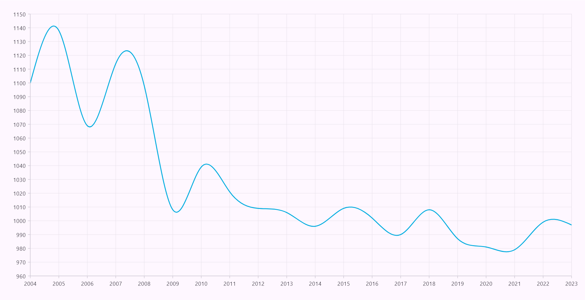
Rendering the Flutter Spline Chart
Step 3: Customizing the Flutter Spline Chart
Once the Flutter Spline Chart is configured, we can customize its appearance based on our needs to make the chart attractive and visually appealing. Here, we are going to add and customize the Flutter Spline Chart with the following elements:
Refer to the following image.
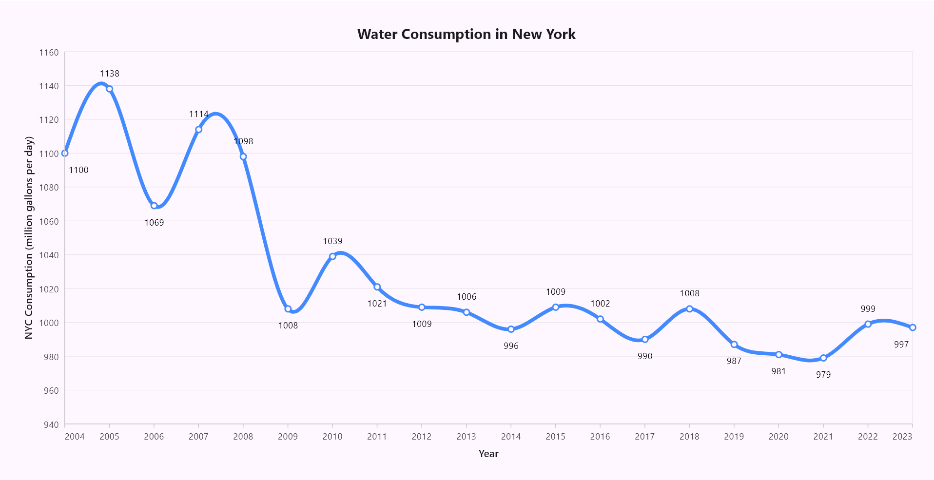
Customizing the Flutter Spline Chart
Now, we’ve completed the configuration and customization of the Spline Chart. Let’s handle the logic to predict future data point trends based on historical data and population growth.
Add a button to initiate future trends
Let’s add a custom button(AIButton) above the chart. When this button is tapped, a circular progress indicator will appear to show that data is loading, and the AI prediction logic will be processed at that time. Although we will address the AI prediction logic in the upcoming sections, we can begin by designing the button with an appealing user interface.
Refer to the following code example.
Stack(
  children: <Widget>[
    _buildCartesianChart(),
    _buildAIButton(context),
    _buildCircularProgressIndicator(),
  ],
),
Here, we have displayed a button and a loading indicator within a stack to display both the button and progress indicator above the chart.
Customizing the AI button
Let’s customize the AIButton with floating animation and attractive colors to enhance its UI. Then, place the button at the top right corner above the Flutter Spline Chart. We’ll also provide tooltip support for the AIButton to indicate its purpose.
Refer to the following code example.
Widget _buildAIButton(BuildContext context) {
  return Align(
    alignment: Alignment.topRight,
    child: Tooltip(
      message: 'Predicts future trends from 2024 - 2029',
      ...
      child: _AIButton(
        onPressed: () async {
          if (_apiKey.isEmpty) return;

          final String prompt = _generatePrompt();
          await _sendAIChatMessage(prompt, _apiKey);
        },
      ),
    ),
  );
}

class _AIButtonState extends State<_AIButton>
    with SingleTickerProviderStateMixin {
  late AnimationController _controller;
  late Animation<double> _animation;

  @override
  Widget build(BuildContext context) {
    return AnimatedBuilder(
      animation: _animation,
      builder: (BuildContext context, Widget? child) {
        return Transform.translate(
          offset: Offset(0.0, _animation.value),
          child: IconButton(
            onPressed: widget.onPressed,
            hoverColor: Colors.lightBlueAccent.shade100,
            icon: SizedBox(
              width: 50.0,
              height: 50.0,
              child: DecoratedBox(
                decoration: BoxDecoration(
                  shape: BoxShape.circle,
                  gradient: RadialGradient(
                    colors: <Color>[
                      Colors.lightBlueAccent.shade100,
                      Colors.lightBlueAccent.shade700,
                      Colors.transparent,
                    ],
                    center: const Alignment(0.1, 0.1),
                    radius: 0.9,
                  ),
                  boxShadow: const <BoxShadow>[
                    BoxShadow(
                      color: Color.fromARGB(120, 25, 25, 112),
                      offset: Offset(8.0, 8.0),
                      blurRadius: 18.0,
                      spreadRadius: 1.0,
                    ),
                    BoxShadow(
                      color: Color.fromARGB(120, 255, 255, 255),
                      offset: Offset(-8.0, -8.0),
                      blurRadius: 18.0,
                      spreadRadius: 1.0,
                    ),
                  ],
                ),
                child: Center(
                  child: Image.asset(
                    'assets/ai_assist_view.png',
                    height: 30,
                    width: 40,
                    color: const Color.fromARGB(255, 0, 51, 102),
                  ),
                ),
              ),
            ),
          ),
        );
      },
    );
  }
}
Refer to the following image.
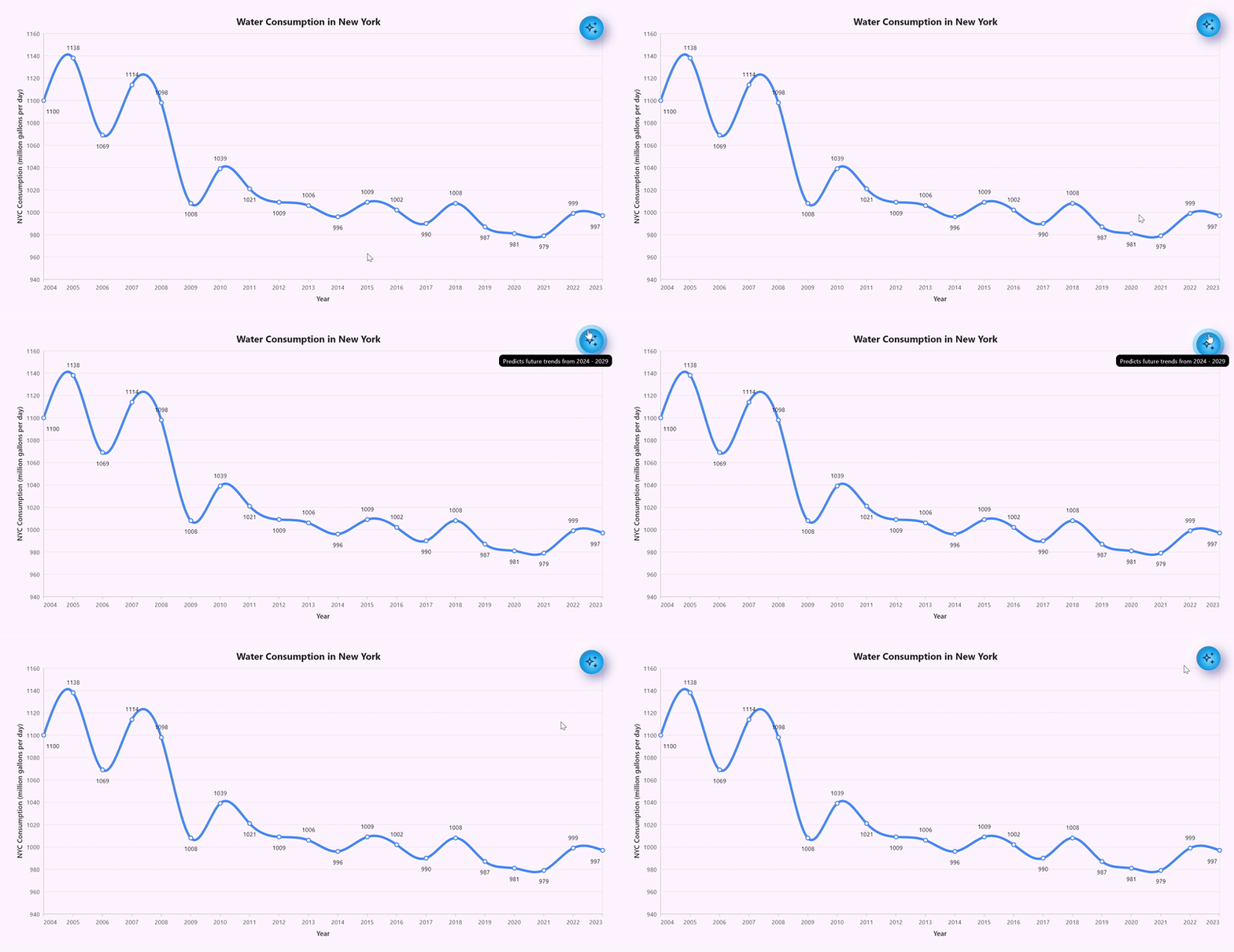
Customizing the AI button with animation
Adding circular progress indicator
When we tap the AI button, the CircularProgressIndicator appears above the chart. We used the ValueListenableBuilder class to update the state of the loading indicator based on the _isLoadingNotifier property.
Widget _buildCircularProgressIndicator() {
  return ValueListenableBuilder(
    valueListenable: _isLoadingNotifier,
    builder: (BuildContext context, bool value, Widget? child) {
      return Visibility(
        visible: _isLoadingNotifier.value,
        child: const Center(
          child: CircularProgressIndicator(),
        ),
      );
    },
  );
}
Refer to the following image.
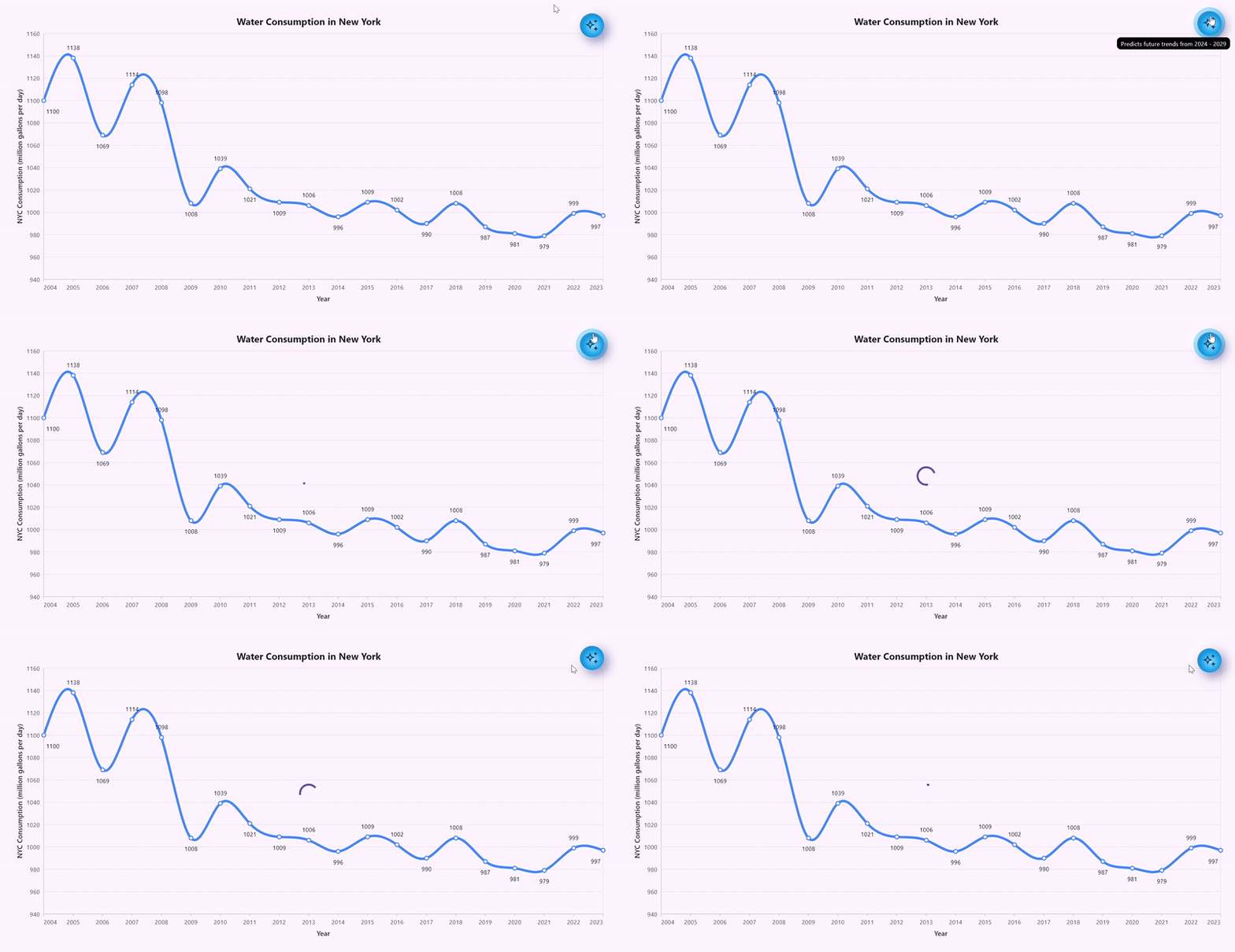
Adding circular progress indicator to the Flutter Spline Chart
Forecast future data trends and update the Flutter Spline Chart
To predict the future trend of water consumption in New York City based on historical data, we will implement the following AI prediction logic in the onPressed event of the AIButton. Subsequently, we will update the Flutter Spline Chart with the newly predicted data points using the updateDataSource method.
Step 1: Create a prompt to request future predicted data points
First, we need to create a prompt asking the AI to predict water consumption trends in New York for the next five years, from 2024 – 2029, upon clicking the AIButton. This prediction should be based on historical data and annual population growth.
We should provide detailed information, including water consumption and population figures for each year. It is important to instruct the AI not to make random predictions, such as constant increases, decreases, or unpredictable changes. Instead, it should focus on providing realistic future forecasts. We can also ask the AI to format its response as yyyy:yValue, which will make it easier for us to process the information later. Feel free to adjust the prompt to meet your specific needs.
String _generatePrompt() {
  . . .
  final String reversedData = _waterConsumptionData.reversed.map(
    (_WaterConsumptionData data) {
      return '''${data.year}: ${data.waterConsumptionInGallons}: ${data.population}''';
    },
  ).join('\n');
  String prompt = '''
  Predict New York City's water consumption for the next 05 years (2024 - 2029)
  using the historical consumption data (2004-2023) and city population
  trends as references. Your predictions should realistically
  reflect past trends and fluctuations, avoiding simple patterns like
  uniform increases, decreases, or irrelevant zig-zag patterns.
  Consider both historical consumption patterns and population growth
  when generating predictions. The x-axis represents years,
  while the y-axis represents water consumption in million gallons per day.
  Do not output any data values for population explicitly, but consider
  the population growth in your predictions for water consumption
  in New York city based on historical city and water consumption growth.
  Ensure each predicted data point meets the following conditions:\n\n
  $reversedData
  ''';
  prompt += '''Output the predictions only in this format: "yyyy:yValue".
    (yValue represents consumption data in gallons).
    Do not include explanations, headers, or any additional text.\n''';
  return prompt;
}
Step 2: Obtain a response from Google AI for the request
To obtain a response from the AI based on our request, we can import the google_generative_ai Flutter package. Ensure that you have added this dependency to the pubspec.yaml file beforehand.
The google_generative_ai package is used to interact with Google AI and obtain responses to our requests. However, to generate and receive responses from the AI, you will need to create an API key. You can create the API key from Google AI for Developers.
Disclaimer:
This sample uses the google_generative_ai package only for demonstration purposes. Before using it, please refer to the following documentation for further details.
1. google_generative_ai Dart package
2. Google_generative_ai license
Once you have created your API key, you will need to generate a GenerativeModel by specifying the model name of Google AI and passing in the created API key. Then, we can generate the response using the sendMessage method from the ChatSession, by providing our generated prompt. The AI analyzes this information to forecast future consumption values, focusing on realistic, data-driven projections rather than simplistic trends.
Future<void> _sendAIChatMessage(String prompt, String apiKey) async {
  // Sets the loading state for asynchronous operations.
  if (mounted) {
    _isLoadingNotifier.value = true;
  }

  try {
    final GenerativeModel model = GenerativeModel(
      model: 'gemini-1.5-flash-latest',
      apiKey: apiKey, // Replace your api key here to predict future data.
    );
    final ChatSession chat = model.startChat();
    final GenerateContentResponse response = await chat.sendMessage(
      Content.text(prompt),
    );
    // Handle the response here...
  } on Object catch (error) {
    if (mounted) {
      ScaffoldMessenger.of(context).showSnackBar(
        SnackBar(
          content: Text('An error has occurred: $error'),
        ),
      );
    }
  }
}
Step 3: Convert the generated response into chart data
The response regarding the predicted future data trend for water consumption in New York over the next 05 years, as provided by Google AI, will be in string format. Therefore, we need to parse the provided response into chart data based on our existing structures.
Future<void> _sendAIChatMessage(String prompt, String apiKey) async {
  . . .
  final List<_WaterConsumptionData> aiRespondedWaterConsumptionEntries =
      _convertAIResponseToChartData(response.text);
  . . .
}

List<_WaterConsumptionData> _convertAIResponseToChartData(String? data) {
  if (data == null || data.isEmpty) return [];
  final List<_WaterConsumptionData> aiConsumptionData = [];
  final List<String> pairs = data.split('\n');
  for (final String pair in pairs) {
    final List<String> parts = pair.split(':');
    if (parts.length == 2) {
      final int year = int.parse(parts[0].trim());
      final double consumption = double.parse(parts[1].trim());
      aiConsumptionData.add(
        _WaterConsumptionData(
          year: year,
          waterConsumptionInGallons: consumption,
          isAIPredicted: true,
        ),
      );
    }
  }
  return aiConsumptionData;
}
Step 4: Update the Flutter Spline Chart based on the predicted data
Once we have parsed the future predicted data into Chart data, we can stop the circular loading indicator that is currently displayed. We then need to update the Flutter Spline Chart using the updateDataSource method. This will allow us to update the chart without refreshing the entire widget. Here, we are updating the chart with a slight delay to animate the future predicted data.
Refer to the following code.
Future<void> _sendAIChatMessage(String prompt, String apiKey) async {
  . . .
  await _updateChartRangeWithDelay(aiRespondedWaterConsumptionEntries);
  . . .
}

Future<void> _updateChartRangeWithDelay(
  List<_WaterConsumptionData> waterConsumptionDataEntries) async {
  // Sets the loading state for asynchronous operations.
  if (mounted) {
    _isLoadingNotifier.value = false;
  }
  // Add the first data point without delay.
  _waterConsumptionData.add(waterConsumptionDataEntries.first);
  _chartSeriesController.updateDataSource(
    addedDataIndexes: <int>[_waterConsumptionData.length - 1],
  );
  // Delay for the rest of the data points.
  for (int index = 1; index < waterConsumptionDataEntries.length; index++) {
    await Future.delayed(const Duration(milliseconds: 500));
    _waterConsumptionData.add(waterConsumptionDataEntries[index]);
    _chartSeriesController.updateDataSource(
      addedDataIndexes: <int>[_waterConsumptionData.length - 1],
    );
  }
}
Refer to the following image.
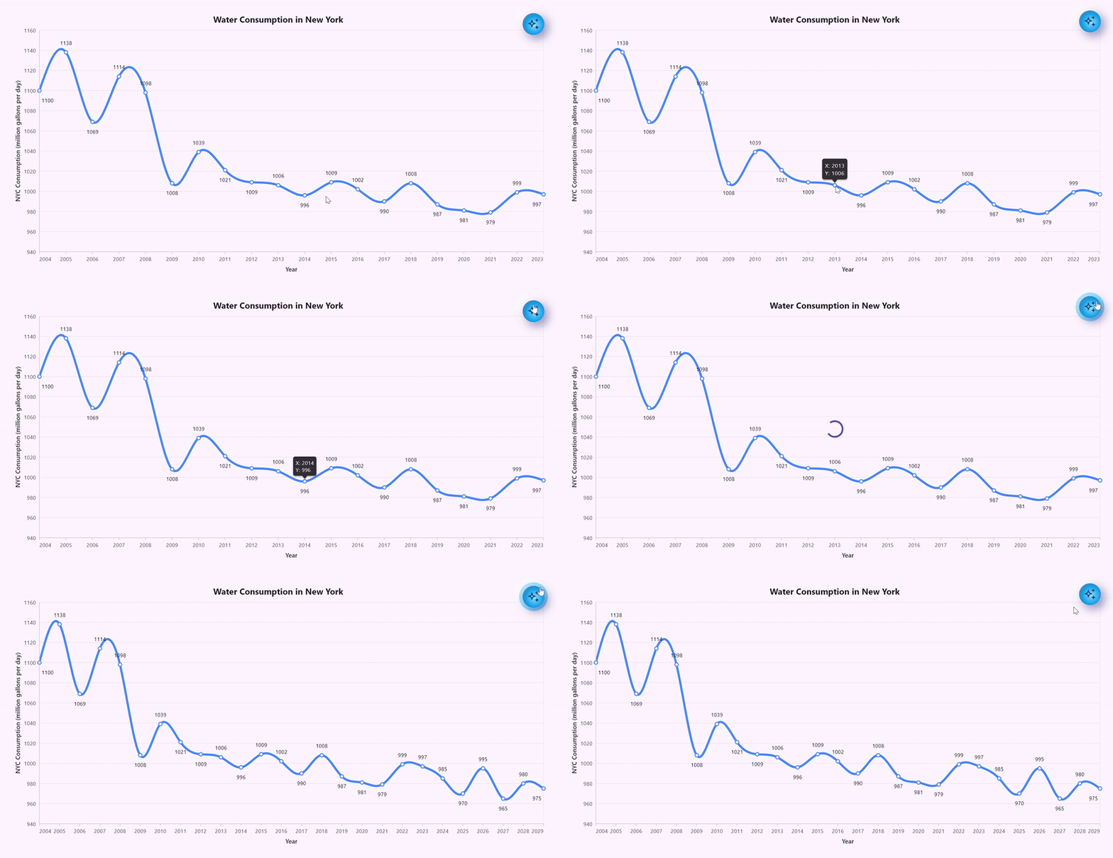
Updating the Flutter Spline Chart based on the predicted data
Step 5: Differentiating the AI-predicted data and predefined historical data
We can customize the appearance of future predicted data to differentiate it from the predefined historical data and make it visually appealing. This can be achieved by using the plotBands of the primaryXAxis and the pointColorMapper properties of the Spline series in the SfCartesianChart.
PlotBand: We will use plotBands to differentiate the background color of the predefined historical and AI-predicted data.
DateTimeAxis(
  . . .
  plotBands: [
    PlotBand(
      opacity: 0.10,
      start: DateTime(2023, 12, 31),
    ),
  ],
);
PointColorMapper: We can use the PointColorMapper to differentiate and display the AI-predicted data and predefined historical data in different colors based on the isAIPredicted boolean property.
SplineSeries<_WaterConsumptionData, DateTime>(
  pointColorMapper:
      (_WaterConsumptionData waterConsumptionData, int index) {
    return waterConsumptionData.isAIPredicted
        ? Colors.lightBlueAccent
        : Colors.blueAccent;
  },
);
Refer to the following image.
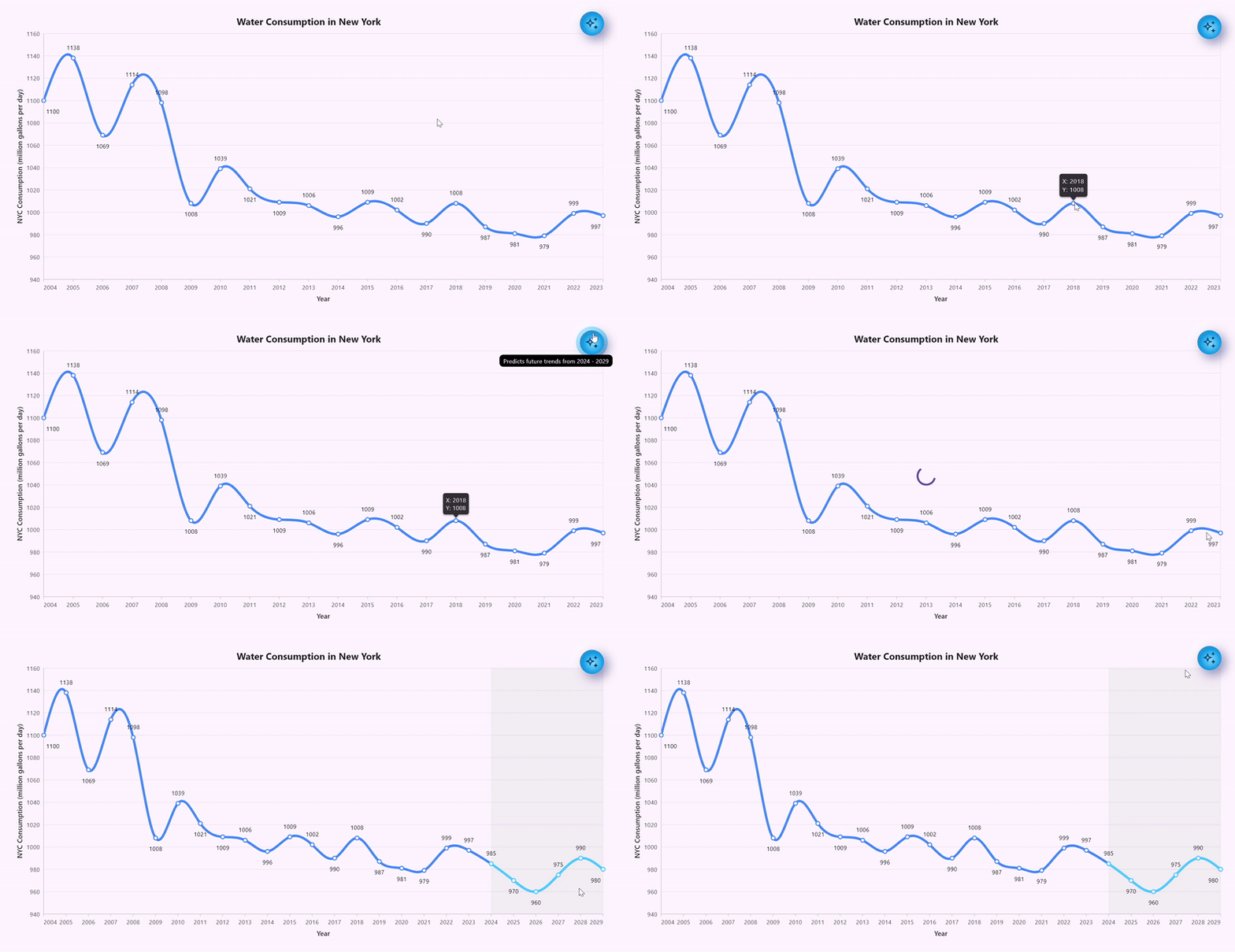
Differentiating the historical and AI-predicted water consumption data using the Flutter Spline Chart
GitHub reference
For more details, refer to water consumption forecasting using the AI-powered smart Flutter Spline Chart Github demo.
Conclusion
Thanks for reading! In this blog, we’ve learned how to forecast water consumption in New York City by collaborating with Google AI and Syncfusion Flutter Spline Chart. Give it a try, and leave your feedback in the comment section below.
If you need a new widget for the Flutter framework or new features in our existing widgets, you can contact us through our support forums, support portal, or feedback portal. As always, we are happy to assist you!
