TL;DR: Discover how to boost the readability of Angular Charts with dynamic color segments. Learn how to create effective line charts using Syncfusion’s Angular Charts component, implement striplines to define data boundaries, and apply color coding to highlight different data segments for enhanced data visualization.
Certainly! Clarity is crucial when dealing with complex and large datasets in charts, especially in line charts where data points are numerous and closely packed. In such cases, the strategic use of colors can make a significant impact.
Syncfusion Angular Charts is a well-crafted charting component for data visualization. It contains a rich UI gallery of 50+ Charts and Graphs, ranging from line to financial, that cater to all charting scenarios.
By integrating dynamic colors into the Angular Charts, you can enhance visual communication, making it easier for viewers to interpret trends, distinguish between multiple datasets, and identify key points or thresholds. This approach not only improves readability but also transforms your charts into more interactive and insightful visualizations.
In this blog, we’ll explore how to use colors to make your Syncfusion Angular Charts clearer and more compelling.
Creating a line chart
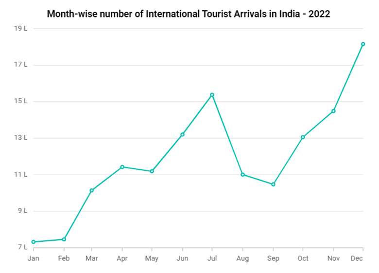
Let’s create a simple line chart using Syncfusion’s Angular Chart component to visualize the number of international tourists arriving in India in 2022.
In the following chart, the x-axis will represent the months of the year, while the y-axis will display the number of tourists.

Creating a line chart in Angular
Although this example is straightforward, it offers a foundational insight into current trends. To further enhance readability, we can apply thoughtful color manipulation to make the data clearer and more insightful.
Defining boundaries with striplines
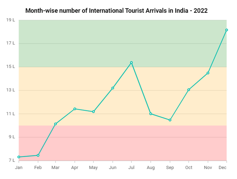
We can use striplines to create a chart that is both visually appealing and highly functional. These will provide the necessary clarity to distinguish between different ranges of tourist arrivals effectively. This approach ensures that the data visualization is comprehensive, making it easier for viewers to understand the variations in tourist arrivals throughout the year.
Refer to the following code example showing three striplines created to represent the specified boundaries.
public primaryYAxis: Object = {
    stripLines: [
      { start: 700000, opacity: 0.2, end: 1000000,
        sizeType: 'Auto', size: 1.5,
        color: 'red', visible: true,
        verticalAlignment: 'Start',
        textStyle: { size: '13px' } },
      { start: 1000000, opacity: 0.2, end: 1500000,
        sizeType: 'Auto', size: 1.5,
        color: 'green', visible: true,
        verticalAlignment: 'Start',
        textStyle: { size: '13px' } },
     { start: 1500000, opacity: 0.2, end: 2000000,
        sizeType: 'Auto', size: 1.5,
        color: 'blue', visible: true,
        verticalAlignment: 'Start',
        textStyle: { size: '13px' } }
    ]}
To achieve the functionality described above, use the stripLine property within the axis module. This property allows you to bind an array of striplines, which visually define the boundaries on the chart. These striplines categorize the tourist arrivals into the following three distinct ranges, providing a clear visual representation of the data:
7 lakhs to 10 lakhs: Considered as low arrivals.
10 lakhs to 15 lakhs: Considered as moderate arrivals.
Above 15 lakhs: Considered as high arrivals of international tourists.
After executing the above code examples, we will get the output that resembles the following image.

Adding boundaries with striplines to the line chart
Adding color segments to the line chart
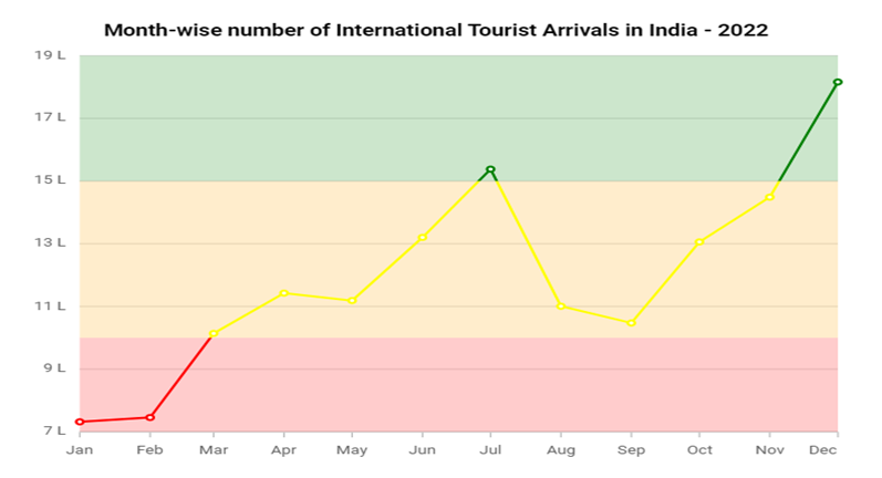
To enhance clarity in our data visualization, we can customize the color of our line series based on specific segments. This versatile technique can be applied to any axis, allowing us to highlight different segments for the number of tourist arrivals to India.
For example, let’s categorize the segments as follows:
Below 10 lakhs: Low (Red)- This represents a lower number of tourist arrivals, and the color red is used to visually indicate lower values.
10 lakhs to 15 lakhs: Moderate (Yellow) – This covers a moderate range of tourist arrivals, with yellow symbolizing a middle ground or average values.
**Above 15 lakhs: High (Green)—**This indicates a high number of tourist arrivals, with green representing positive growth or high values.
By defining these segments, we can more easily differentiate between varying levels of tourist arrivals. To implement this, specify the segments as shown in the following code example.
_ index.html _
<e-series-collection>
 <e-series [dataSource]="series1" type="MultiColoredLine" xName="x" yName="y" segmentAxis="Y" name="Australia" width="2" [marker]='circleMarker' [segments]="segments">
 </e-series>
</e-series-collection>
In the above code example, the segmentAxis property specifies the axis the chart should use to determine segments. In this example, it’s set to the Y-axis (segmentAxis=”Y”), segmenting the line based on Y-axis values. The segments property binds a predefined array of segments that determine how the line should be colored. Each segment can have its own color, which can be defined based on value ranges or other criteria.
_ App.component.ts _
public segments: Object[] = [
    { value: 1000000, color: 'red', },
    { value: 1500000, color: yellow ' },
    { color: ‘green ', },
];
After executing these code examples, we will get the output as follows.

Adding color segments to the line chart
Reference
For more details, refer to the StackBlitz demo on enhancing the Angular Charts’ readability with dynamic colors.
Conclusion
Thanks for reading! In this blog, we’ve explored how to improve the readability of the Syncfusion Angular Charts using colors for better data visualization. Try out these techniques and leave your feedback in the comments section below.
To try our Angular Charts control, please download our free trial. You can also check out our online demos and documentation for a more in-depth look at what you can do with the Charts component.
If you have questions, you can contact us through our support forums, support portal, or feedback portal. We are always happy to assist you!
